Aesthetic flower pot painting isn’t about showing off skill. It’s about control. Most people ruin the look by adding too many colors, too many patterns, or trying to copy complex designs that don’t fit their space. What actually works is limited palettes, clean shapes, and intentional spacing. If your goal is trendy home decor, you need designs that sit quietly in a room and still look styled. This list focuses on ideas you can execute fast, with cheap materials, while still getting that clean, curated look people associate with aesthetic spaces.
1. Minimal Beige Line Art Pots
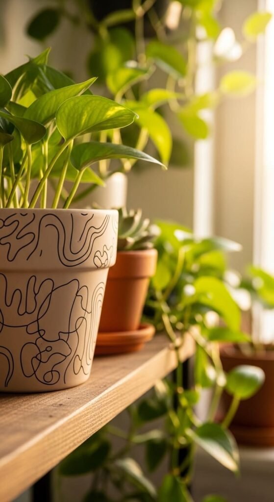
Start with a beige or off-white base.
Use a thin brush to draw simple line shapes. Curves work better than straight lines.
Don’t plan too much. The moment you try to control it, it looks stiff.
Leave empty space. That’s what makes it look aesthetic.
Cheap tip: use leftover wall paint for the base instead of buying new acrylic.
Works well on shelves or desks where clutter already exists.
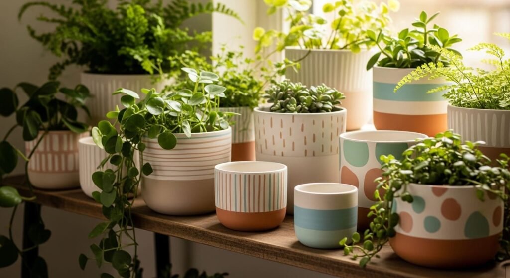
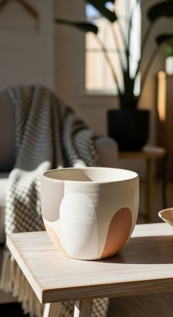
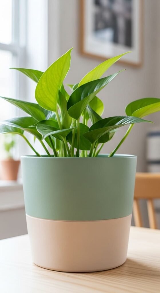
2. Soft Pastel Block Pots
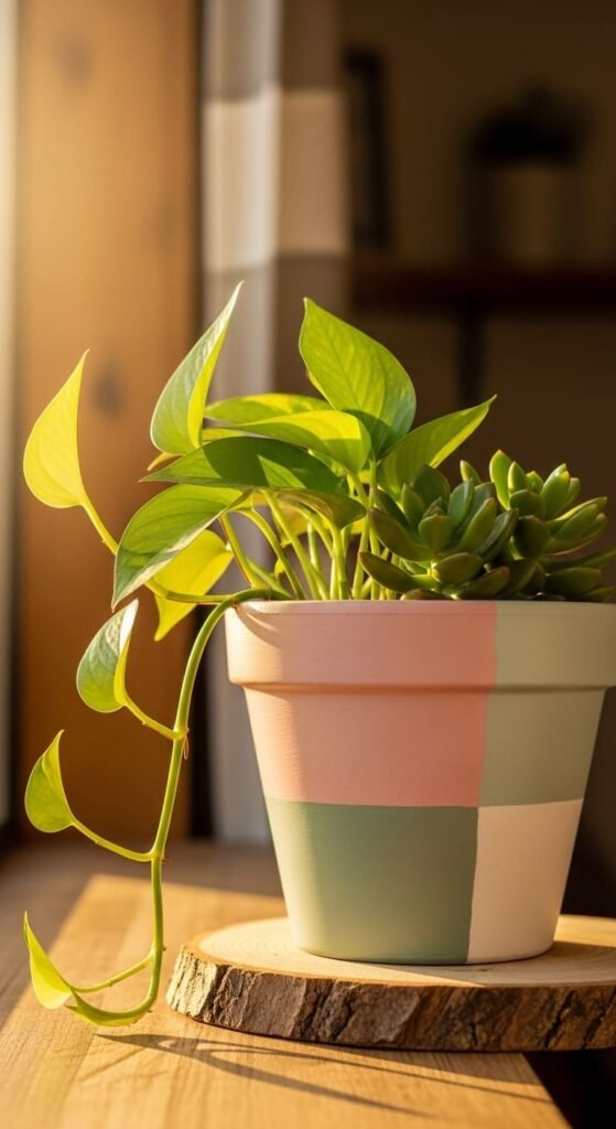
Divide the pot using tape.
Use muted colors like blush, sage, or dusty blue.
Stick to three colors max.
Keep edges sharp.
If colors feel too bright, mix a little white to tone them down.
This fits small apartments and modern interiors easily.
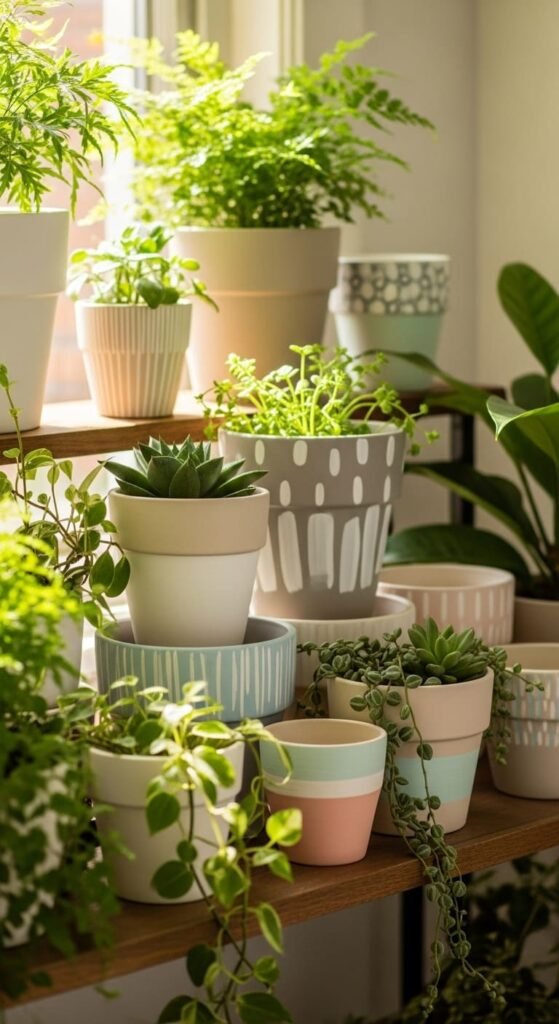
3. Matte White Texture Pots
Paint the entire pot white.
Use uneven strokes on purpose.
Don’t smooth it out.
That slight texture adds depth without adding color.
It looks expensive even though it costs almost nothing.
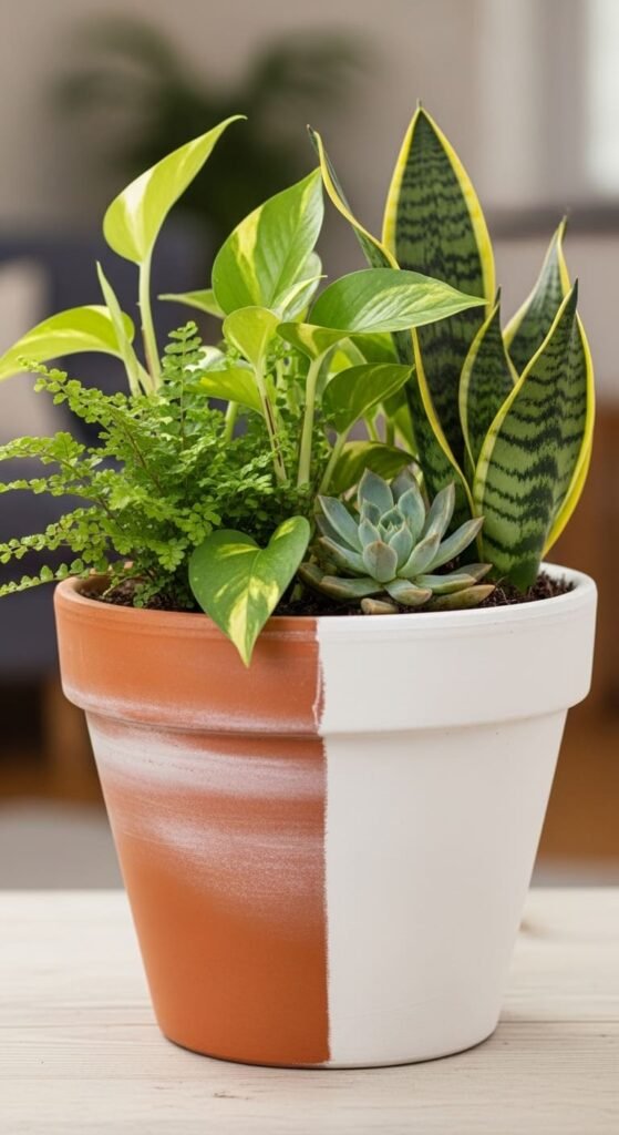
4. Half Black Half Clay Pots
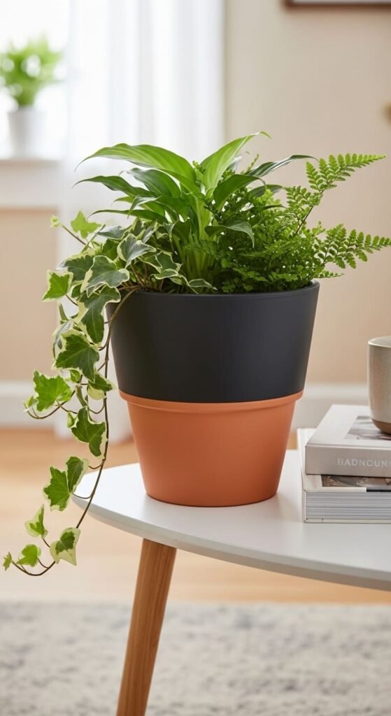
Tape the pot halfway.
Paint one side black.
Leave the other raw.
That contrast does all the work.
Don’t add anything else.
5. Tiny Dot Grid Pots
Use a toothpick or dotting tool.
Make small dots in a grid pattern.
Keep spacing consistent.
Use only one dot color.
This works because it’s subtle.
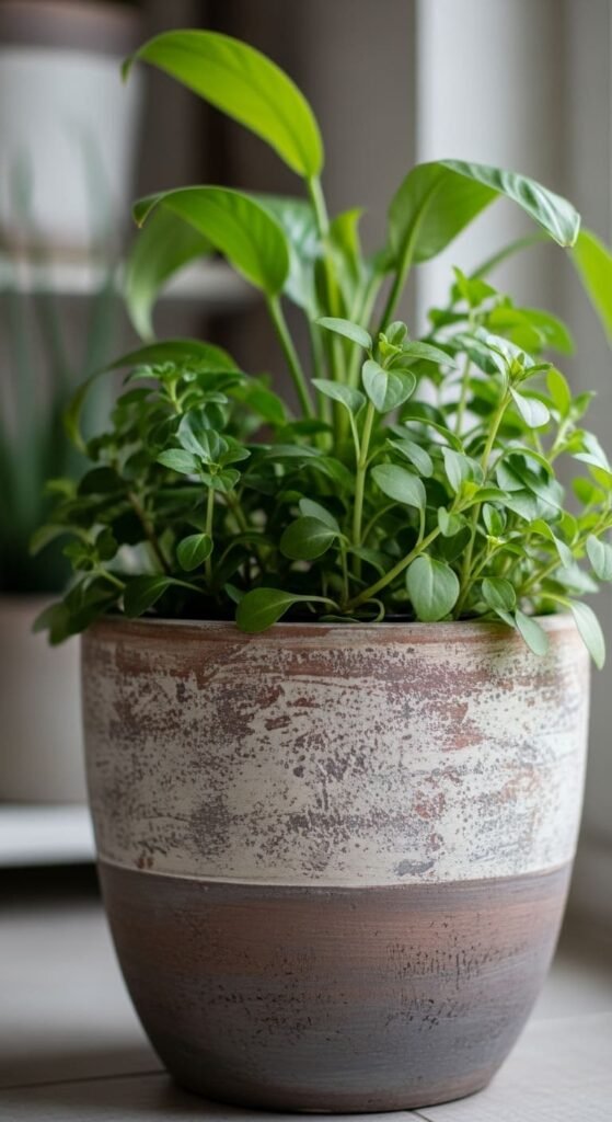
6. Earth Tone Layered Pots
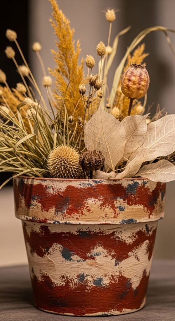
Use brown, rust, and cream.
Layer them in uneven sections.
Don’t try to blend perfectly.
Rough edges look better here.
Pairs well with wooden furniture.
7. Minimal Arch Pattern Pots
Paint simple arch shapes.
Use 2–3 colors only.
Keep shapes large.
Avoid adding outlines or details.
This design works because it stays simple.
8. Soft Ombre Neutral Pots
Use two neutral shades.
Blend lightly.
Don’t overwork the transition.
Slight imperfection makes it look natural.
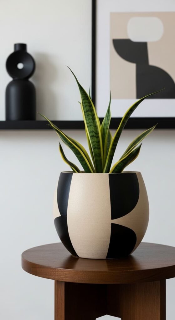
9. Scandinavian Black Pattern Pots
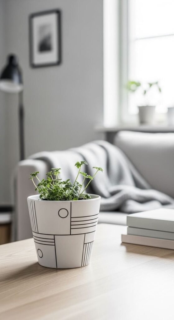
Use black on white.
Add small shapes like lines or triangles.
Keep spacing even.
Avoid filling the entire pot.
10. Abstract Brush Stroke Pots
Use a flat brush.
Apply random strokes.
Stick to 2–3 colors.
Don’t layer too much.
This works because it feels casual.
11. Monochrome Grey Pots
Pick one grey shade.
Apply thin coats.
Keep the finish smooth.
Looks clean and modern.
12. Soft Pink Minimal Pots
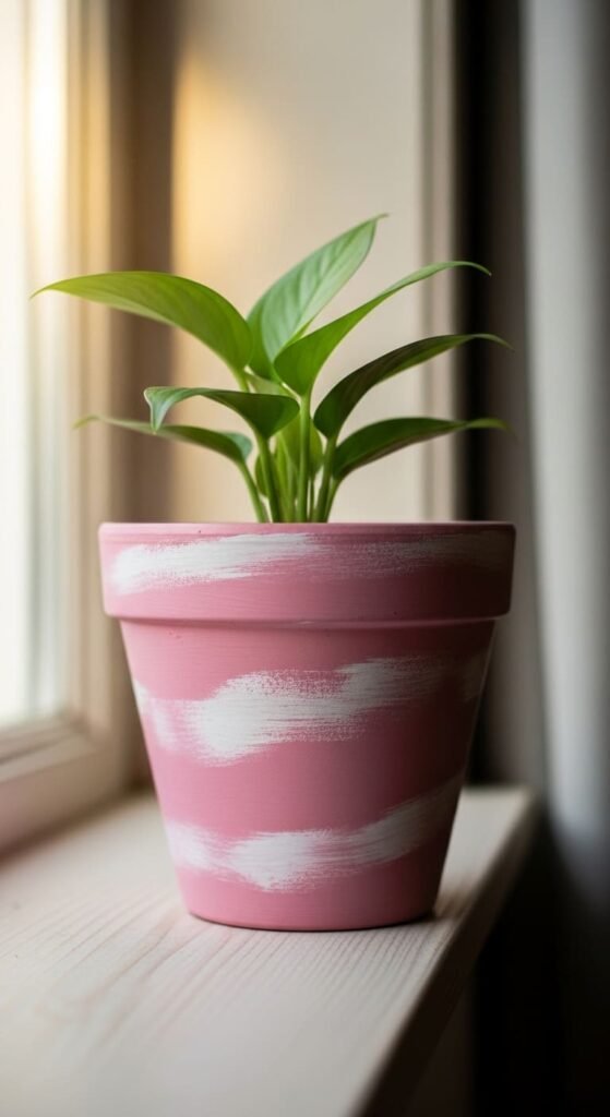
Use muted pink.
Add small white details.
Keep design light.
Works well in soft-toned spaces.
13. Thin Line Grid Pots
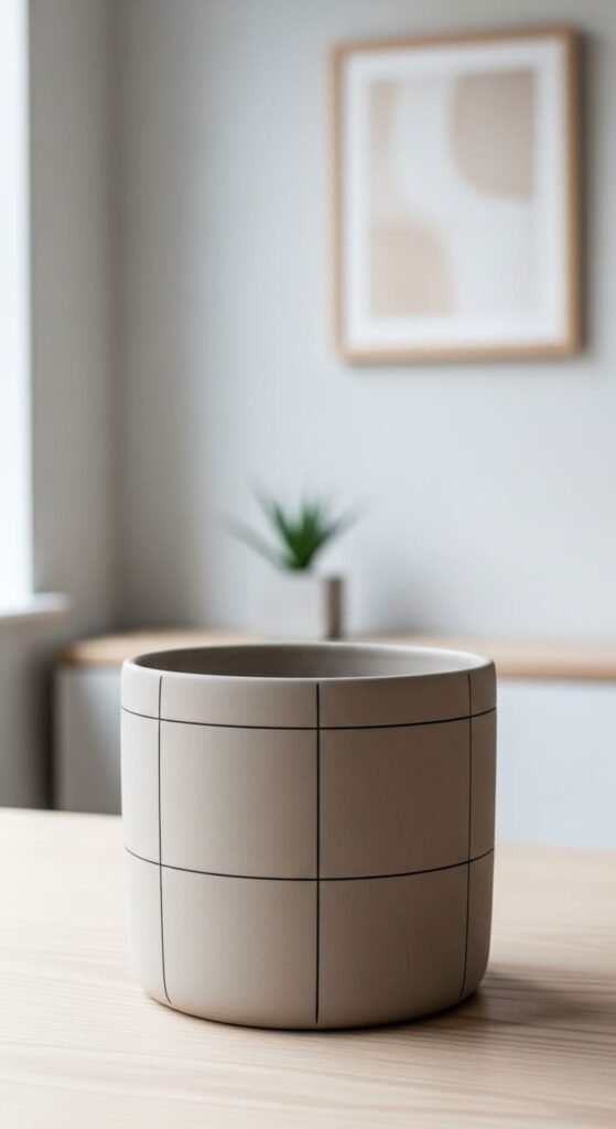
Draw thin lines.
Keep them straight.
Leave enough space between lines.
Simple grid looks structured.
14. Clay and White Split Pots
Paint half white.
Leave half natural.
Clean line matters.
No extra design needed.
15. Light Speckled Pots
Use a toothbrush.
Flick paint lightly.
Keep speckles small.
Too much ruins the look.
16. Beige and Black Accent Pots
Use beige base.
Add black shapes.
Keep shapes simple.
Contrast creates focus.
17. Minimal Wave Line Pots
Draw soft wave lines.
Use two colors.
Keep spacing consistent.
Avoid sharp edges.
18. Dry Brush Texture Pots
Use very little paint.
Drag brush lightly.
Creates soft texture.
Works best with neutrals.
19. Two Tone Soft Contrast Pots
Split pot into two colors.
Keep tones soft.
Clean dividing line matters.
Simple but effective.
20. Minimal Leaf Accent Pots
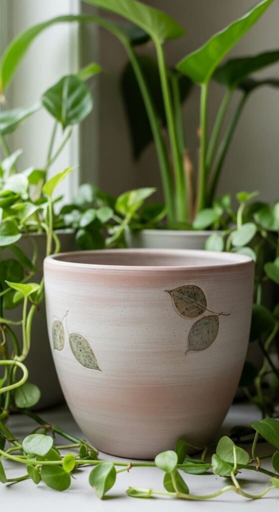
Add small leaf shapes.
Use one accent color.
Don’t fill the surface.
Keep it minimal.
21. Muted Rainbow Arc Pots
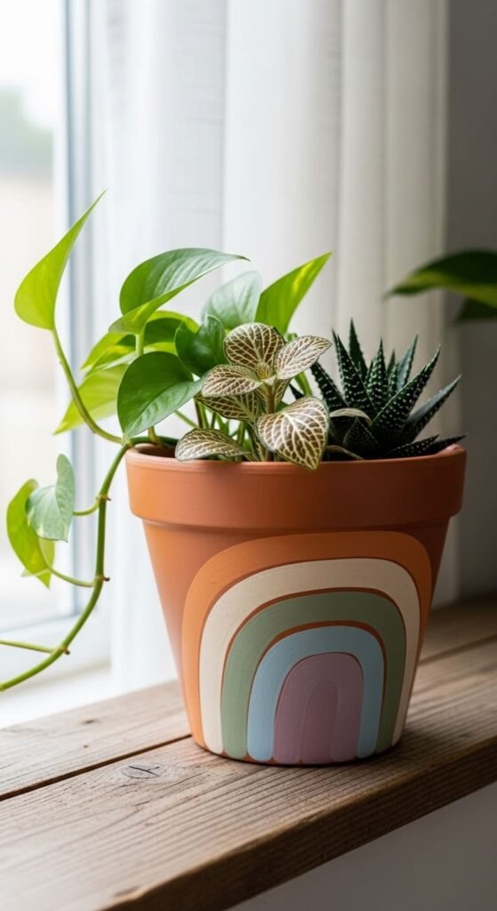
Paint simple arcs.
Use muted tones.
Keep shapes clean.
Avoid bright colors.
22. Soft Marble Neutral Pots
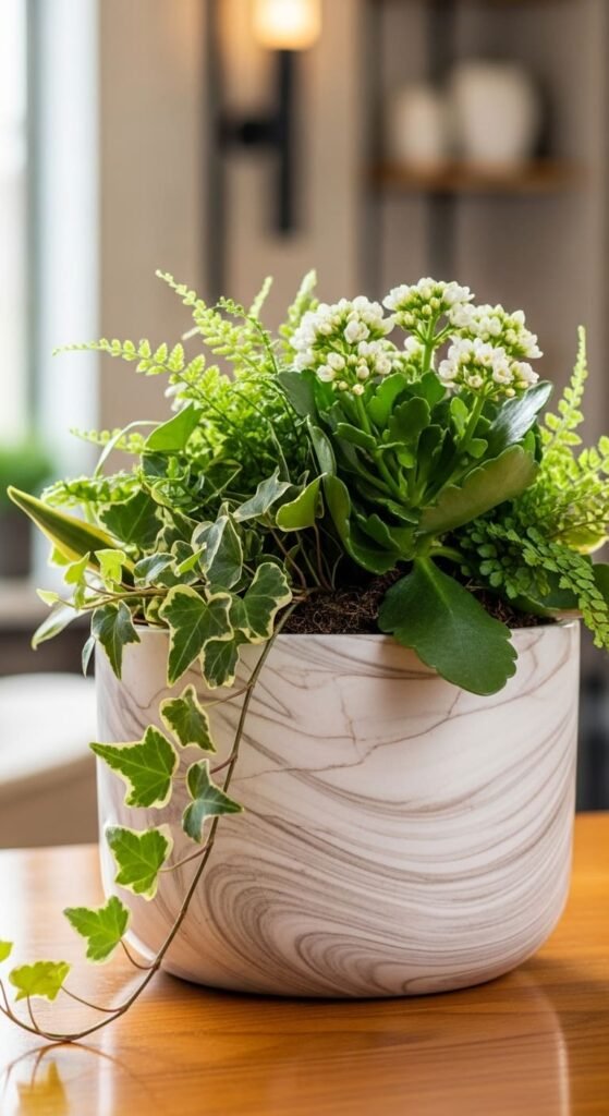
Use two neutral shades.
Create soft swirls.
Don’t overwork.
Keep pattern subtle.
Conclusion
Most people try to make pots stand out too much. That’s exactly why they fail. Aesthetic designs work because they stay controlled. Fewer colors. Fewer shapes. Cleaner execution. Pick one idea, keep it simple, and actually finish it. That’s what turns a basic pot into something worth displaying.