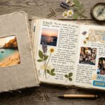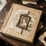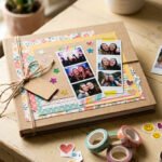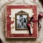
Your scrapbook cover is the first thing anyone sees. It sets the mood before a single page turns. A good travel cover pulls people in and holds the memory of a trip long after the tan fades. The best part? You don’t have to spend much or own fancy tools to make one look beautiful. A photo, some tape, a scrap of fabric, and a little patience go a long way. Below are 23 cover ideas you can copy today. Each one comes with simple steps, cheap material swaps, and small tricks that make a homemade cover look like it came from a shop. Pick the style that matches your trip and start building something you’ll actually want to show off.
1. The Single Full-Bleed Photo
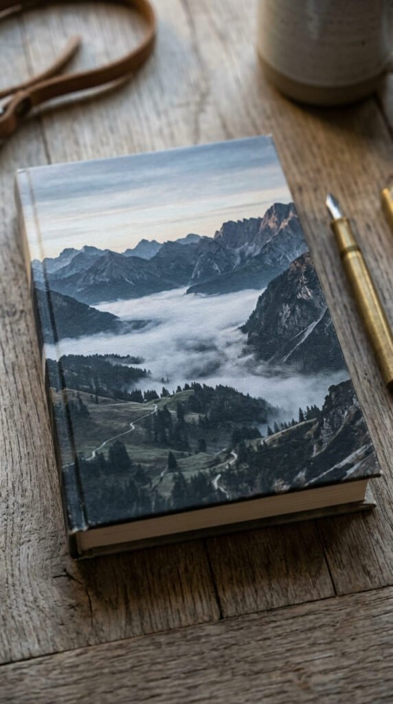
One strong photo can carry your whole cover. Pick your best shot from the trip and let it fill the entire front, edge to edge. No borders, no clutter. This works because a single image tells the story fast.
Choose a photo with clear contrast and one main subject. A lone road, a beach, a mountain. Busy photos get lost when shrunk down.
For printing, set your file to 300 DPI so it stays sharp. Add a small bleed margin, around 3mm, so nothing important sits near the trim edge.
Budget tip: print your photo at a local pharmacy or use a home printer with matte photo paper. Matte hides fingerprints better than gloss. Glue it down with a thin, even layer of craft glue applied with a scrap of card to avoid bubbles.
Want it tougher? Cover the whole thing with clear contact paper. It costs almost nothing and acts like a laminate.
Crop tight for drama. A face, a wave, a doorway. The closer the crop, the more it feels intentional rather than accidental.
2. The Photo Collage Grid
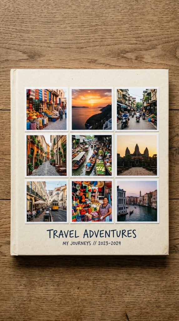
Can’t pick just one photo? Use several. A collage grid holds many moments on one cover without looking messy, as long as you keep the spacing even.
Stick to a simple layout. Three by three, or two by four. Equal gaps between each photo read as tidy and planned.
Keep the photos the same size. Uneven squares make the whole thing feel rushed. A paper trimmer with a grid mat helps you cut clean, matching edges every time.
Mix wide shots with close-ups so the eye has variety. One landscape, one face, one food photo, one detail. That rhythm keeps it interesting.
Budget tip: free tools like Canva have travel collage templates you can fill with your own photos, then print as one sheet. That saves you cutting and aligning by hand.
Leave a thin white border around each photo. It acts like a frame and stops the images from blurring into one another.
If you glue them separately, use a ruler and light pencil marks first. Erase the lines after. Straight rows do most of the work here.
3. The Stitched Fabric Cover
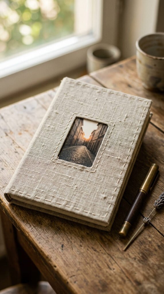
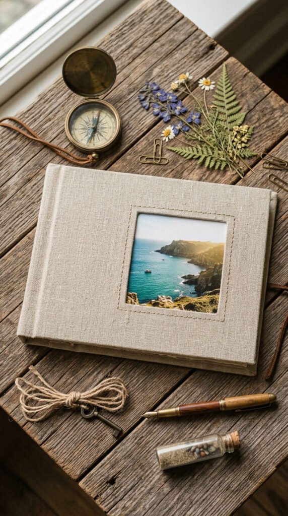
Fabric gives a cover something photos can’t: texture you want to touch. A scrap of linen or canvas wrapped around a plain journal feels warm and handmade right away.
Cut your fabric a little larger than the cover. Fold the edges over and glue them to the inside using fabric glue or a hot glue gun.
Add a stitched window in the center to frame one photo. Sew a simple running stitch around a square opening. Slip a photo behind it.
Budget tip: old shirts, tote bags, and pillowcases give you free fabric. Linen offcuts from a craft store often sit in the bargain bin too.
Keep your stitches loose and even. Perfect isn’t the goal here. Slightly uneven stitching looks handmade in a good way.
Press the fabric flat with a warm iron before gluing. Wrinkles show up more than you’d expect once it’s mounted.
Match your thread to the trip. Blue thread for a coastal journal, rust for a desert one. Small color choices tie the whole thing together.
4. The Vintage Sepia Look
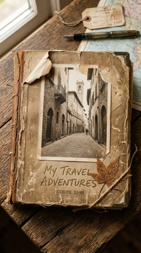
Want your trip to feel like an old memory? Go vintage. Sepia tones and worn edges make a fresh trip look like a treasured story from years back.
Start with a photo edited to sepia or soft brown. Most phone editors have a one-tap filter for this. Lower the brightness slightly for that aged feel.
Age the paper edges by hand. Rub the borders with a used tea bag or coffee-soaked cloth. Let it dry fully before you glue.
Budget tip: brown kraft paper as a background costs pennies and already looks vintage. Tear the edges instead of cutting for a rougher, older look.
Pick a serif font for any title. Rounded modern fonts break the mood. Something with small tails reads as classic.
Add one small keepsake like a pressed leaf or an old stamp. It grounds the whole vintage feel in something real.
Keep colors muted. Skip anything bright or neon. Creams, browns, and dusty tones do the heavy lifting for this style.
5. The Map Background Cover
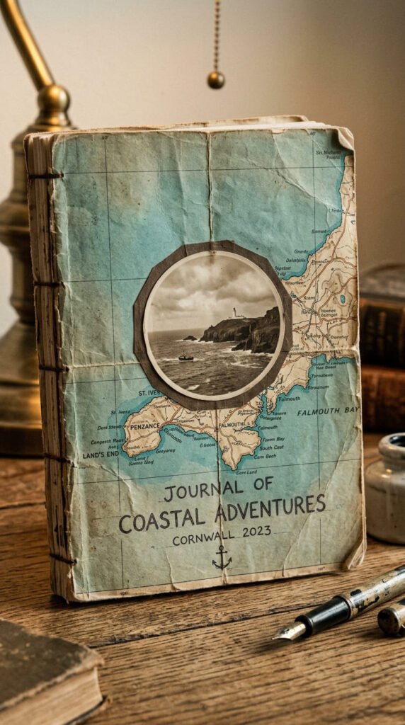
Nothing says travel like a map. Use an actual map as your background and let the routes and place names do the decorating for you.
Free maps are everywhere. Grab a tourist map from your trip, print a section from an online map, or use a page from an old atlas.
Glue the map flat across the whole cover. Smooth it from the center outward to push air bubbles to the edges.
Mount one photo in the middle over the map. A round photo works well here. It breaks the grid of the map lines nicely.
Budget tip: old road atlases sell cheap at charity shops and thrift stores. One book gives you enough map pages for many covers.
Trace your route with a thin red thread or a dotted pen line. It shows exactly where you went and adds a personal touch.
Highlight the town you visited with a small heart or star. A tiny mark turns a generic map into your map. Seal it with contact paper so the map doesn’t tear at the folds.
6. Foil or Embossed Titles
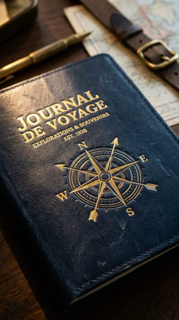
A little shine makes a cover feel expensive. Gold or silver detailing lifts a plain cover into keepsake territory without much cost.
You don’t need a foil machine. Gold and silver paint pens draw clean metallic lines and lettering. Test on scrap paper first to get the flow right.
For a raised look, trace your title with puffy fabric paint or a glue gun, let it dry, then paint over it. The bump catches the light like real embossing.
Budget tip: gold washi tape and metallic sticker letters cost little and skip the drawing entirely. Peel and stick your title in seconds.
Keep foil to small areas. A title, a small icon, a thin border. Too much shine looks busy and cheap rather than rich.
Pair gold with dark backgrounds. Navy, black, or deep green make metallics pop. On pale paper, gold can disappear.
Add a simple embossed symbol near the title. A compass, a plane, a small star. Repeat that symbol somewhere inside for a matched set.
7. The Windowed Cameo Cover
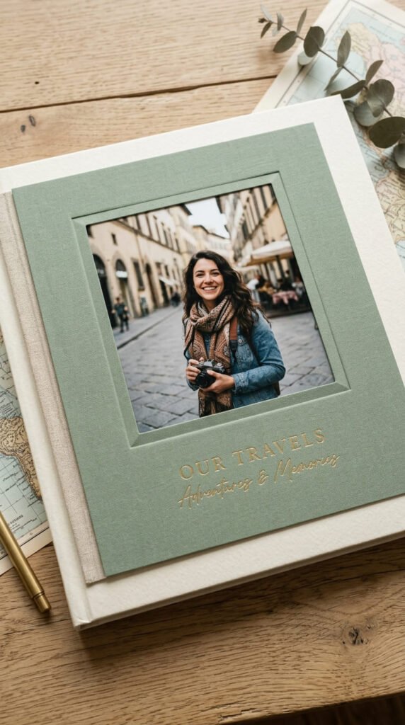
A window cover shows one photo like a picture frame. Cut a neat opening in the front and let a single image peek through from underneath.
Measure your window carefully. Mark it with a ruler and pencil, then cut with a sharp craft knife against a metal ruler. Slow, steady cuts stay straight.
Mount your photo behind the opening so it sits centered. Tape it from the inside so no edges show on the front.
Budget tip: thick cardstock or an old cereal box gives you a sturdy window layer for free. Cover it with plain paper or paint for a clean finish.
Bevel the inside edge of the window slightly for a deeper, framed look. Just sand or trim the cut edge at a light angle.
Keep the surround simple. A plain color around the window makes the photo the star. Busy patterns fight with the image.
Try a shaped window instead of a rectangle. A circle, an arch, or a rounded square adds character. Trace a cup or lid for a clean curve.
8. Minimal Typographic Cover
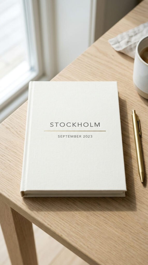
Sometimes less says more. A clean cover with just a place and a date feels modern, calm, and grown-up.
Skip the photos entirely. Center your destination name and the year on a plain background. White space does the design work.
Choose two fonts at most. One for the place name, one smaller for the date. Mixing more than two looks noisy fast.
Budget tip: print your text at home on nice paper, or hand-letter it if your writing is neat. A steady hand costs nothing.
Play with size. Make the place name large and bold. Drop the date small underneath. That contrast creates a clear order for the eye.
Add one thin line under the title to anchor it. A single rule looks deliberate and finished.
Stick to one or two colors. Black on cream. Navy on grey. Restraint is the whole point of this style.
Leave plenty of empty space around your text. Crowding the edges undoes the clean look. Let the cover breathe and the words stand out.
9. Collage With Caption Strips
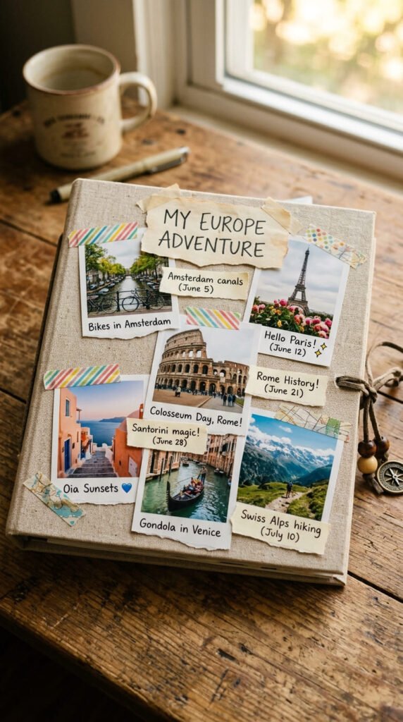
Photos show the where. Captions add the story. Pairing small photos with short handwritten notes makes a cover people actually want to read.
Keep captions tiny. One or two words each. “Best pizza.” “Got lost.” “Rainy day.” Short lines pack more charm than full sentences.
Cut caption strips from scrap paper. Tear the edges for a relaxed feel. Tuck them beside or under each photo.
Budget tip: use the back of receipts, ticket stubs, or old envelopes for caption paper. Free scraps beat buying new sheets.
Handwrite the captions. Your own writing makes it personal in a way printed text can’t. Use a fine black pen for clean, readable lines.
Layer the strips slightly over photo corners. That overlap looks intentional and ties the pieces together.
Add small bits of washi tape to hold strips down. The tape doubles as decoration. Match tape colors to your photos.
Don’t line everything up perfectly. A slight tilt on captions keeps the whole thing loose and friendly rather than stiff.
10. Eco-Friendly Natural Cover
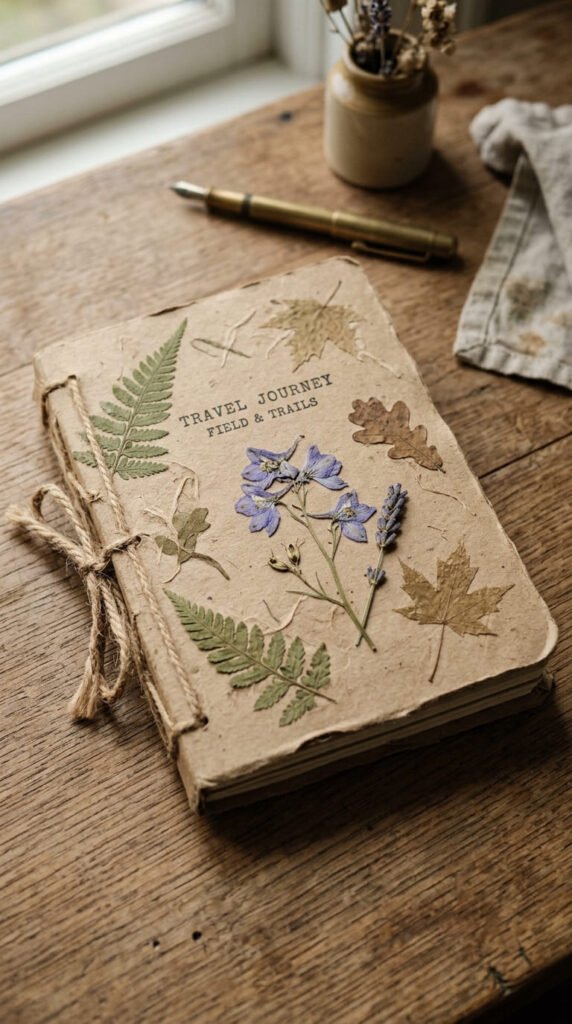
Kind to the planet, easy on the wallet. Natural and recycled materials make a cover that feels grounded and honest.
Start with kraft paper or a recycled cardboard base. Both look great bare and cost next to nothing.
Add real bits of nature. Pressed flowers, dried leaves, a sprig of something from your trip. Flatten them in a book for a few days first.
Budget tip: everything here is basically free. Collect leaves on your travels and press them as you go. Twine and kraft paper are cheap craft staples.
Bind or wrap with natural jute or cotton twine instead of ribbon. It suits the earthy look and holds well.
Skip plastic laminate. Use a light beeswax rub to protect the paper instead. It gives a soft sheen and keeps the natural feel.
Keep colors muted and warm. Browns, greens, soft creams. Let the materials show their real texture rather than painting over them.
Write your title straight onto the kraft paper. A simple pen line suits the plain, honest style better than fancy lettering.
11. The Pocket-Sized Mini Cover
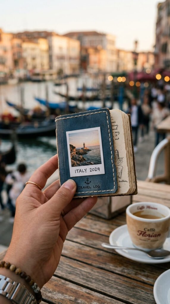
Big journals stay home. A pocket-sized book travels with you and its little cover has its own kind of charm.
Small size means small decoration. One tiny photo, one little word, a thin border. Anything more crowds the mini cover.
Make your own mini book by folding a few sheets in half and stapling the spine. Cut a cardstock cover to match.
Budget tip: a stack of index cards bound with a ring makes an instant mini scrapbook. Decorate the top card as your cover.
Use a single small photo cropped tight. On a tiny cover, one clear image beats a cluster of unreadable ones.
Add a thin stitched or drawn border to frame the whole front. It makes the small size feel finished, not unfinished.
Keep it sturdy. Small books get shoved in bags and pockets. A layer of contact paper protects the cover from wear.
Punch a hole and add a short loop of twine. Now you can clip it to a bag and fill it as you travel.
12. Mixed-Media Ephemera Cover
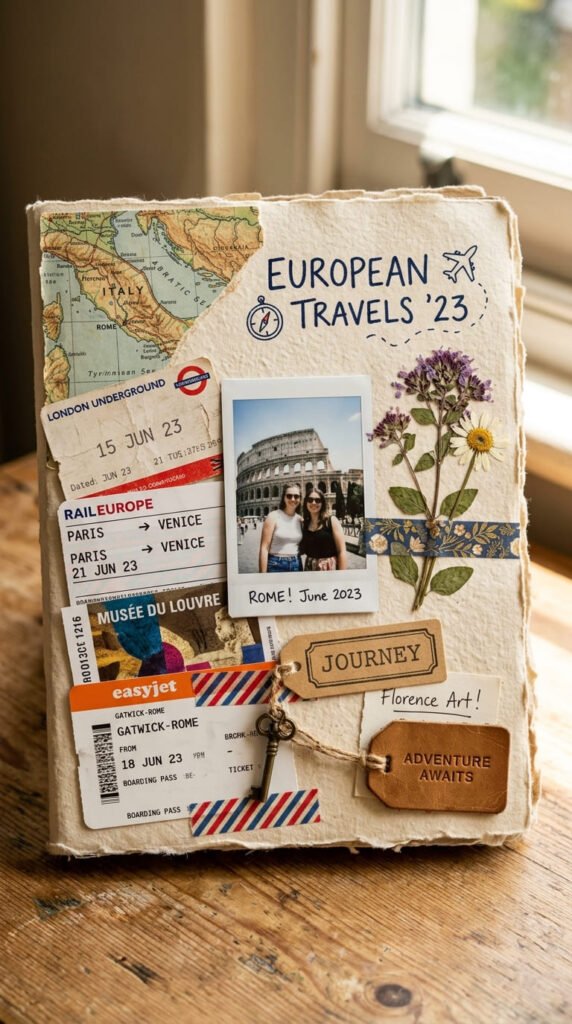
Save the little things. Ticket stubs, receipts, and scraps from your trip make a cover packed with real memories.
Gather your bits as you travel. Bus tickets, museum passes, a pretty receipt, a bit of packaging. Small flat items work best.
Layer them loosely across the cover. Let corners overlap. That stacked, collected look is the whole appeal here.
Budget tip: this style costs nothing. You’re using trip leftovers you’d throw away anyway. That’s the magic of it.
Anchor the busiest area with one clear photo so the eye has somewhere to rest. Pure clutter tires the eye out.
Use washi tape and glue to hold pieces down. Tape corners rather than gluing whole items so they stay slightly loose and real.
Trim oversized pieces to fit. A big ticket can lose an edge without losing its meaning.
Seal the finished cover with contact paper. It flattens the layers and stops loose corners from catching and tearing over time.
13. Passport and Ticket Theme
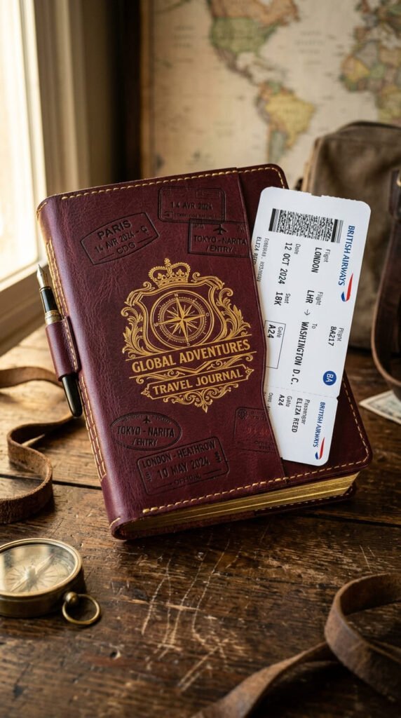
Lean into the travel documents theme. A passport-style cover turns your journal into a playful nod to the trip itself.
Start with a deep color base. Burgundy, navy, or forest green match real passport covers and set the tone instantly.
Add a fake emblem in the center. Draw or print a simple crest, a globe, or a compass in gold. Keep it small and centered.
Make stamp marks around the cover. Carve a simple shape into a rubber eraser and stamp with ink. Circles and arcs read as travel stamps fast.
Budget tip: a potato or eraser stamp costs almost nothing and makes endless stamp marks. Ink pads are cheap and last for years.
Add a slot on the side for a boarding-pass-shaped paper. Cut a strip that slides in and out like a real ticket.
Use a bold official-looking font for any text. Something plain and strong suits the document look better than a fancy script.
Keep the layout balanced and centered. Real documents are symmetrical, and that neatness sells the whole idea.
14. Monogram or Initials Cover
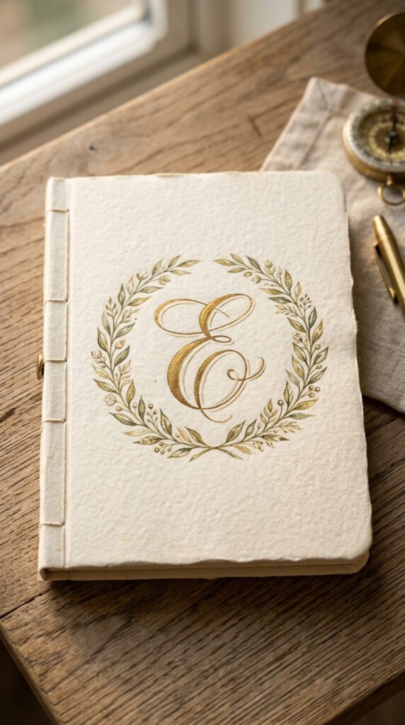
Make it clearly yours. A single large initial on the cover feels personal, classy, and simple to pull off.
Pick one letter. Your first initial, or the trip’s destination letter. One big letter reads better than a full name.
Place it dead center and make it large. A bold monogram fills the space and needs little else around it.
Budget tip: print a large letter in a font you like, then trace it onto your cover and fill it in with paint or pen. No special skills required.
Add a small wreath or frame around the letter. A simple ring of leaves or a thin box makes it look designed.
Choose your color to match the trip. Sandy gold for a beach trip, deep green for a forest one. The letter carries the theme.
Keep the background plain. A single texture or solid color lets the monogram stand out clearly.
Try metallic for the letter itself. Gold or copper against cream looks like a proper keepsake. A paint pen does this in one pass.
15. Travel Quote Cover

A few good words can carry a cover. A short travel quote over a photo pairs feeling with image in a way that sticks.
Keep the quote short. Three to six words. Long quotes get hard to read and crowd the photo underneath.
Pick a photo with a calm area for the text. Sky, sand, or water gives you clean space to write on. Busy spots hide the words.
Add a soft overlay behind the text if the photo is busy. A light white or dark box, slightly see-through, keeps words readable.
Budget tip: hand-letter the quote yourself for a personal feel, or print it on clear sticker paper and lay it over the photo.
Match the font mood to the words. A loose script for dreamy lines, a bold block for punchy ones. The style should back up the meaning.
Place the quote off-center for a modern look. Bottom-left or top-right feels more designed than dead center.
Keep the color simple. White text on dark photos, dark text on light ones. Contrast is what makes it readable.
16. Destination Color Palette Cover
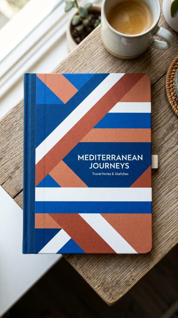
Let color tell the story. Match your cover to the place you visited and the palette alone will bring the trip to mind.
Think about your destination’s colors. Greek islands are blue and white. Deserts are rust and gold. Forests are deep greens and browns.
Pick three colors that capture the place. Two main shades and one accent. More than three starts to look random.
Paint or paper simple color blocks across the cover. Stripes, bands, or a split design all work well with a set palette.
Budget tip: paint swatches from a hardware store are free and give you exact color chips to arrange and glue down.
Skip photos entirely for a bold graphic look. The colors do all the talking here. It’s clean, modern, and quick to make.
Add one small detail in your accent color. A thin line, a dot, a tiny shape. It ties the palette together.
Keep edges crisp. Use masking tape to get clean lines between color areas, then peel it while the paint is still slightly wet.
17. Printable Template Cover
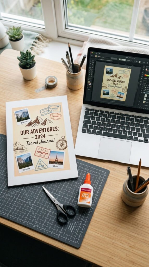
Short on time or nervous about design? Use a ready-made template. Fill it with your photos and print. Done.
Free tools like Canva have travel cover templates built for this. Swap in your photos, change the text, and you’re finished in minutes.
Pick a template that matches your book size. Measure your cover first so the print fits without awkward trimming.
Budget tip: most template tools are free to use. You only pay for printing, which a home printer or local shop handles cheaply.
Change the colors and fonts to make a template your own. A few tweaks stop it looking like everyone else’s cover.
Print on thicker paper if you can. Standard printer paper feels flimsy as a cover. Cardstock holds up much better.
Line up the print with your book before gluing. Templates print with crop marks. Cut along them for a clean, exact fit.
Save your finished design. If the cover ever wears out, you can reprint the same one instead of starting from scratch.
18. Photo-Window Dust Jacket
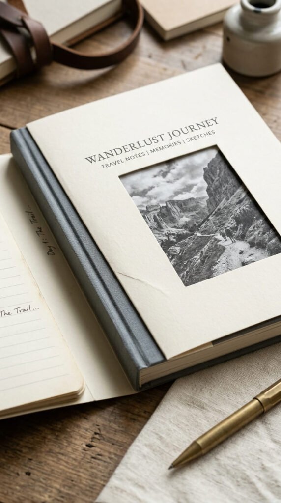
Add a layer for a small wow moment. A dust jacket with a cut-out gives your cover a real bookshop feel.
A dust jacket is just a paper wrap that slides over the cover. It folds around the front and back edges to stay put.
Cut a window in the jacket so the photo underneath shows through. The two layers create depth you can’t get flat.
Budget tip: a single sheet of nice paper makes the whole jacket. Wrapping paper, a poster, or kraft paper all work.
Measure the fold flaps carefully. They tuck inside the front and back covers and hold the jacket in place without any glue.
Cut the window before folding the jacket. It’s much easier to cut cleanly on a flat sheet than around folded edges.
Make the jacket removable on purpose. Being able to slide it off and see the plain cover underneath is half the charm.
Match the jacket color to the photo it frames. A soft, plain wrap lets the photo through the window shine.
19. Travel Stamp and Postmark Cover
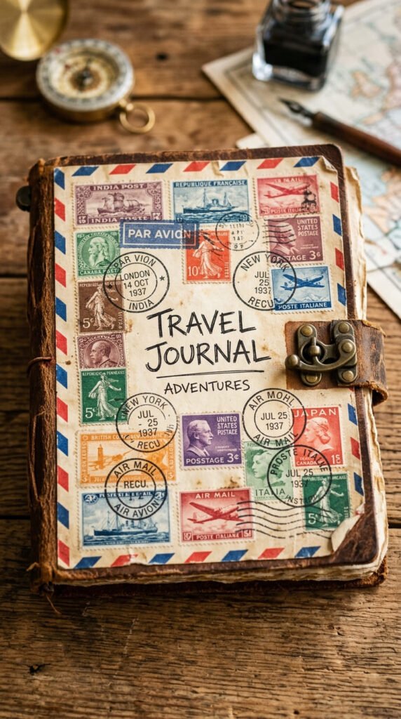
Channel the look of old mail. Stamps and postmarks give a cover an instant sense of far-off places and journeys.
Collect real stamps if you have them. Old letters, stamp packs from craft stores, or printed stamp images all work.
Arrange them across the cover in a loose scatter. Overlap a few corners so it looks collected over time, not placed on a grid.
Add postmark circles around the stamps. Draw rings with a fine pen, or stamp them with a bottle cap dipped in ink.
Budget tip: print stamp and postmark images from free clip-art sites, or reuse stamps from mail you already get. Both cost nothing.
Add the classic airmail border of red and blue dashes around the edge. It signals travel instantly and frames the whole cover.
Age the background paper for a worn, posted-long-ago feel. A light tea stain does this in minutes.
Keep one clear focal point among the stamps. A photo or a bold title stops the collage from becoming pure noise.
20. Minimal Icon Cover
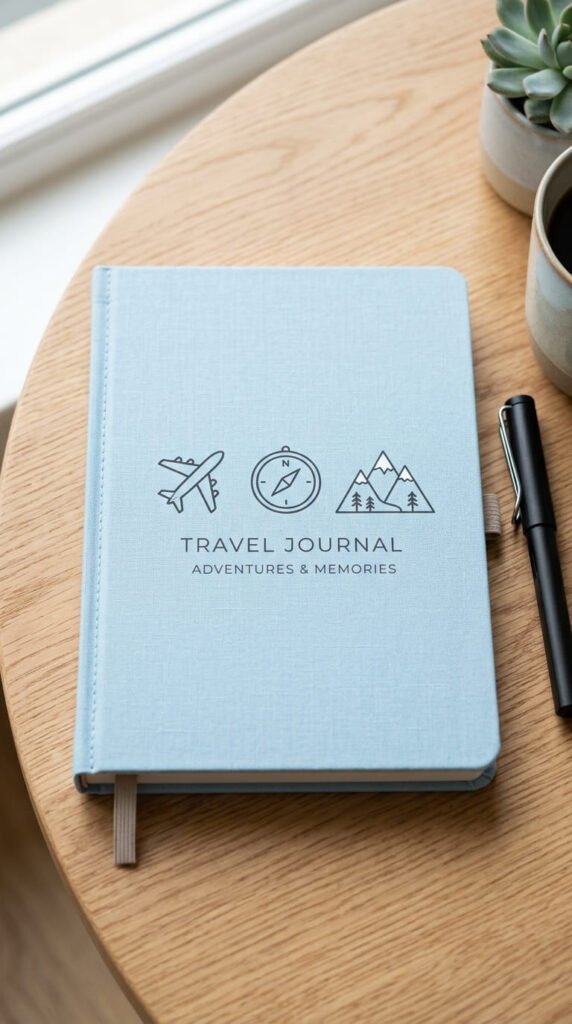
Small symbols, big clarity. A few simple icons tell people what’s inside without a single photo.
Pick three or four icons that fit your trip. A plane, a mountain, a wave, a compass. Simple line shapes read best.
Draw them small and in a neat row or cluster. Keep them the same size and style so they look like a matched set.
Budget tip: trace icons from your phone or copy simple shapes freehand. A fine black pen is the only tool you really need.
Keep the background plain. A solid color or soft texture lets the icons stand out clean and clear.
Repeat one icon larger as a focal point if you like. One big compass with smaller icons around it creates a nice order.
Use one color for all the icons. Matching them ties the set together. Mixing colors makes it feel scattered.
Space them evenly. Even gaps look planned and calm. Crowded icons lose their simple charm.
Add a tiny place name under the icons if you want context. Small text keeps the clean look intact while naming the trip.
21. QR Code Hybrid Cover
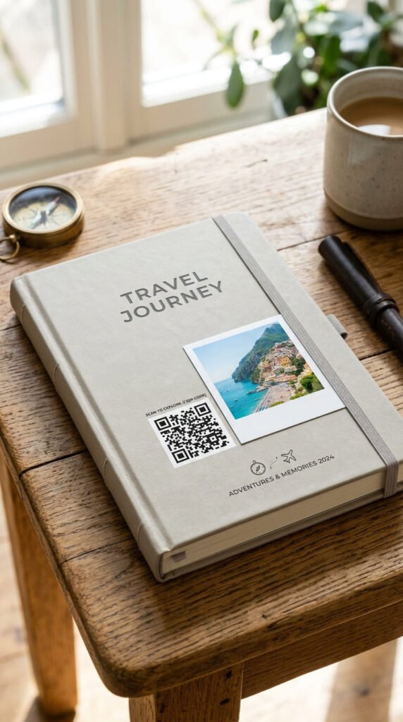
Bring your cover to life. A QR code that links to a trip video joins your paper scrapbook to your phone footage.
Make a free QR code online. Point it at a video, a photo album, or a playlist from your trip. Free tools generate these in seconds.
Print the code small and place it in a corner. It doesn’t need to dominate. A quiet square is enough.
Pair the code with one photo so the cover still looks like a scrapbook, not a tech gadget. The photo leads, the code supports.
Budget tip: QR generators are free, and the code prints on plain paper. This adds a modern feature at zero extra cost.
Test the code before gluing it down. Scan it with your phone to confirm it opens the right link. Fix it now, not later.
Keep the link updated. Point the code at a folder you control so you can change what it shows over time.
Add a tiny play symbol next to the code. A small hint tells people the code leads to something worth scanning.
22. Themed Trip-Type Cover
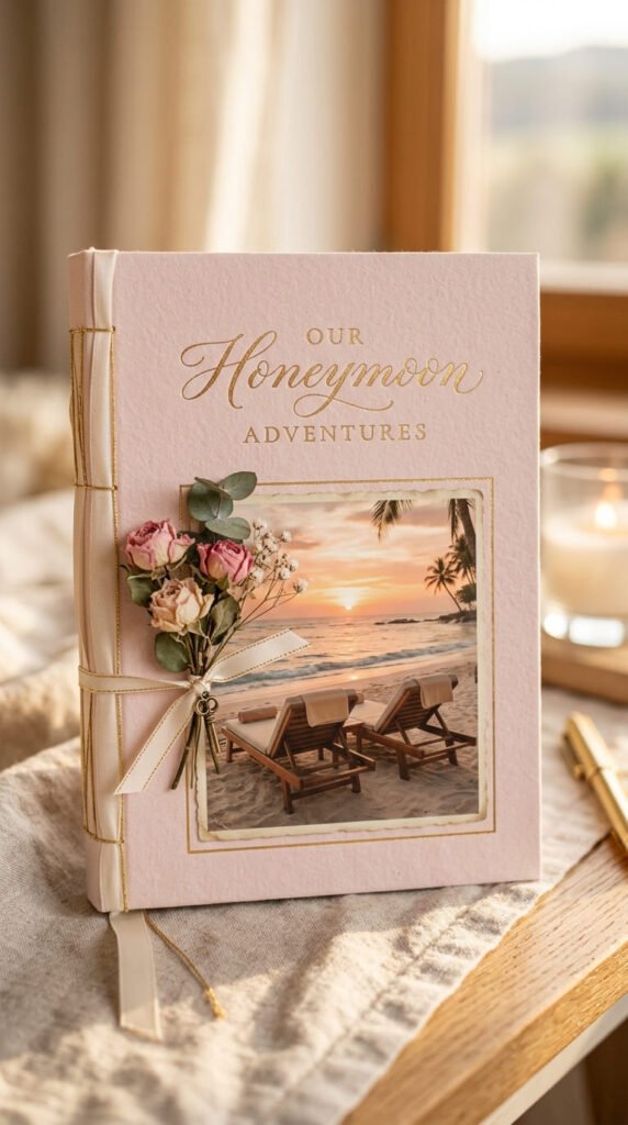
Match the cover to the kind of trip. A honeymoon looks different from a backpacking run and your cover should show it.
Think about your trip’s feeling first. Romantic, rugged, family fun, solo quiet. That mood guides every choice you make.
For a honeymoon, go soft. Blush tones, fine ribbon, a gentle photo. For backpacking, go rough. Kraft paper, bold marker, worn edges.
Budget tip: the theme decides your materials, and most match things you already own. Ribbon scraps for romance, cardboard for adventure.
Pick colors that carry the mood. Warm pastels feel tender. Earthy browns feel rugged. Bright primaries feel like family fun.
Add one detail that names the trip type. Two beach chairs for a honeymoon. A tiny backpack doodle for a trek.
Keep the style consistent inside too. A cover that promises soft and romantic should open onto pages that feel the same.
Let the trip’s real character lead. The most personal covers come from leaning into what actually made your trip yours.
23. Ten-Minute Washi Tape Cover
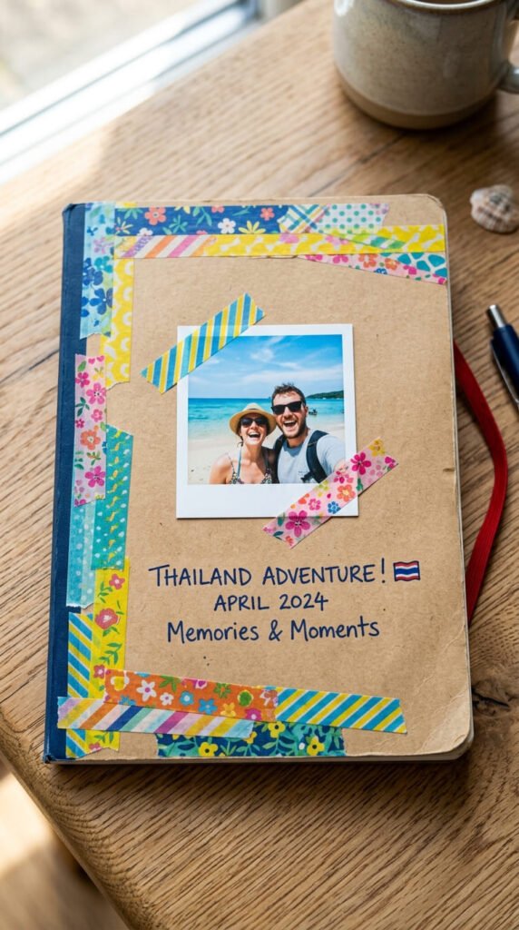
No time, no problem. A washi tape cover takes ten minutes and still looks put together.
Washi tape is the hero here. It’s cheap, comes in endless patterns, and peels off clean if you make a mistake.
Run strips of tape along the cover edges to make a quick frame. Overlap a couple of patterns for a layered look.
Stick one photo in the center and tape its corners down. That’s honestly enough for a cover that works.
Budget tip: a small pack of washi tape costs little and lasts through many projects. One roll goes a long way.
Add a simple handwritten label under the photo. Your destination and the year, written straight onto the tape or a scrap of paper.
Mix widths for interest. A fat strip with thin ones beside it looks more designed than all the same size.
Don’t overthink it. The whole point of this one is speed. A slightly messy washi cover has an easy, cheerful charm that fussy covers miss.
Conclusion
Your travel scrapbook cover doesn’t have to be perfect or expensive to feel special. Every idea here uses cheap materials, simple tools, and skills you already have. A photo and some glue. A scrap of fabric. A strip of washi tape. That’s all it takes to turn a plain journal into something that holds your trip for years. Pick the one style that matches your last adventure and start today. Print that photo. Cut that window. Stick down that tape. The cover you make in an afternoon becomes the first page of a memory you’ll keep coming back to. So grab your favorite trip photo and get making. Your best journey deserves a cover worth opening.