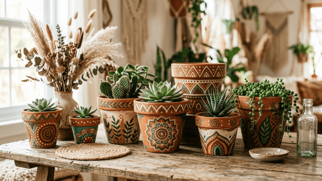
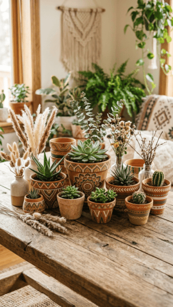
Boho flower pot painting isn’t about precision. If you’re chasing perfect lines and symmetry, you’re missing the point. The entire style leans into imperfection, texture, and relaxed patterns. Terracotta already gives you a strong base. You just build on that using warm tones, rough brushwork, and simple motifs. Most people overcomplicate this. You don’t need expensive tools or artistic skill. You need restraint and a clear idea. The following ideas strip it down and show you exactly how to create pots that look handmade instead of forced.
1. Sashiko Stitch Pattern Pot
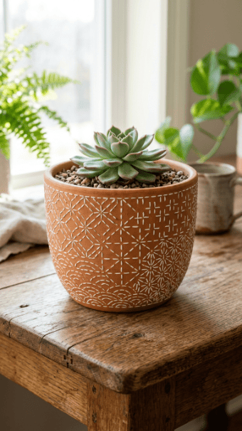
Start with raw terracotta or a muted brown base. Don’t overpaint it. The clay color already works.
Use a thin brush or paint marker to draw simple white stitch lines. Keep spacing uneven. Perfect symmetry kills the handmade look.
Focus on repeating small shapes. Dashes, crosses, or tiny diamonds. That’s enough.
If your lines wobble, leave them. That’s what makes it feel real.
Cheap option: use a white paint pen instead of a brush. Easier control, less mess.
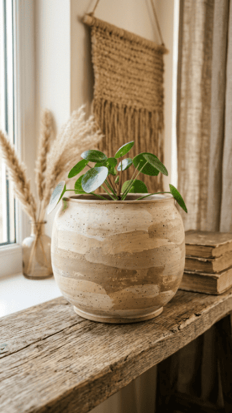
2. Warm Sand Ombre Pot
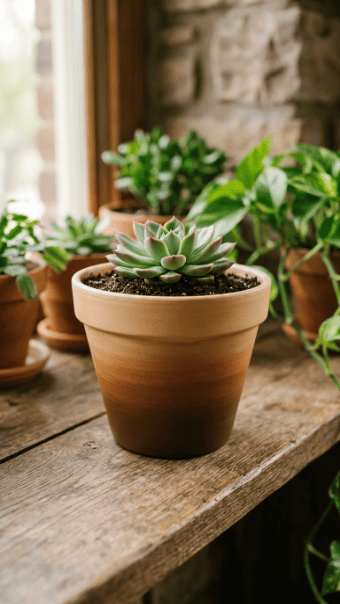
Ombre looks harder than it is.
Pick two shades. Dark brown and beige work well. Paint the darker tone at the bottom.
Before it dries, blend upward with the lighter color using a dry brush.
Don’t overwork it. A slightly rough transition looks better than a forced smooth fade.
Use cheap acrylic paint. No reason to spend more.
3. Freehand Floral Boho Pot
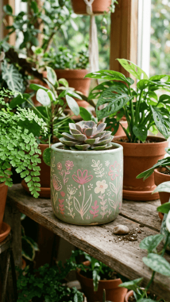
Skip stencils. Draw directly.
Use a sage or neutral base. Once dry, paint simple flower shapes. Circles and petals. Nothing complex.
If you mess up, paint over and redo. No big deal.
Keep spacing loose. Crowded designs look chaotic.
4. Dry Brush Textured Pot
This is where most people fail. They use too much paint.
Dip your brush lightly. Wipe most of it off. Then drag it across the surface.
You’ll get rough, broken strokes. That’s the goal.
Layer different shades slowly. Don’t try to finish in one pass.
5. Gold Rim Accent Pot
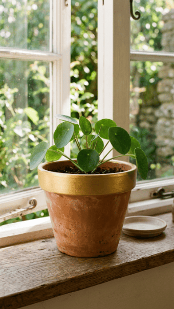
You don’t need to paint the whole pot.
Just add a gold rim. That’s enough to change the look.
Use painter’s tape for a clean edge. Or freehand if you’re confident.
Metallic paint works best in thin layers.
6. Basket Weave Illusion Pot
Draw vertical and horizontal lines in alternating tones.
Keep them slightly uneven.
That creates a woven look without actual texture.
7. Mandala Centerpiece Pot
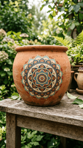
Start from the middle. Build outward.
Use dots and simple shapes.
Don’t try complex patterns. You’ll ruin it.
8. Speckled Artisan Glaze Pot
Dip a toothbrush in paint. Flick it.
That’s it.
You’ll get a random speckled finish that looks handmade.
9. Pastel Wave Boho Pot
Use light colors.
Paint loose wave lines around the pot.
Keep spacing irregular.
10. Feather Motif Pot
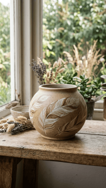
Paint simple feather shapes.
Use thin strokes.
Don’t overfill the space.
11. Crescent Moon Pot
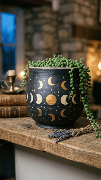
Use a dark base.
Add moons in gold or white.
Keep it minimal.
12. Layered Paint Drip Pot
Pour small amounts of paint from the rim.
Let gravity do the work.
Don’t control it too much.
13. Ribbed Texture Paint Effect
Use a dry brush.
Drag vertical lines.
Keep spacing uneven.
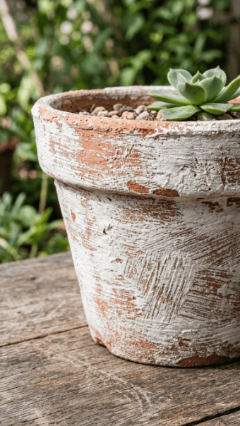
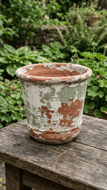
14. Distressed Vintage Pot
Paint the pot fully.
Then sand edges lightly.
Expose the clay underneath.
15. Leaf Stencil Boho Pot
Use a stencil for cleaner shapes.
Apply paint lightly.
Don’t overload the brush.
16. Mandala Rim Pattern Pot
Focus only on the rim.
Add repeating shapes.
Leave the body plain.
17. Earth Tone Geometric Pot
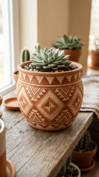
Use simple shapes.
Triangles work best.
Stick to 2–3 colors.
18. Succulent Cluster Boho Set
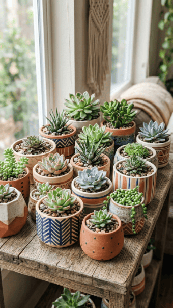
Make several pots.
Each with a different design.
Group them together.
19. Matte Green Minimal Pot
Sometimes no pattern works better.
Use matte paint.
Keep it plain.
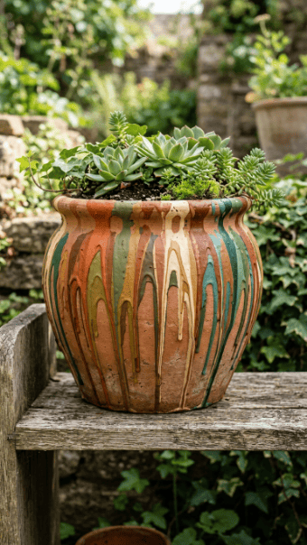
20. Multi-Glaze Mediterranean Pot
Layer colors unevenly.
Let them overlap.
Don’t try to smooth it out.
21. White Line Tribal Pattern Pot
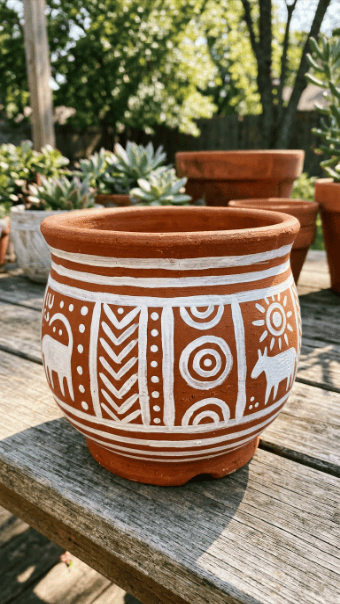
Use thick white lines.
Keep patterns simple.
Repeat shapes.
22. Clay Texture Highlight Pot
Don’t cover everything.
Let clay show through.
It adds depth.
23. Soft Pink Boho Pot
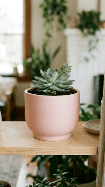
Use a pink base.
Add small black lines or dots.
Keep it subtle.
24. Gold Foil Distressed Pot
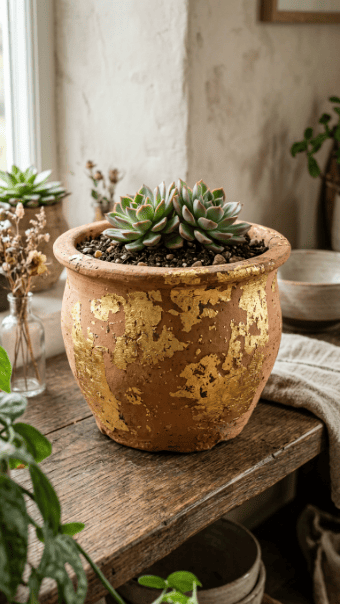
Apply adhesive in random spots.
Press gold foil.
Let it stay uneven.
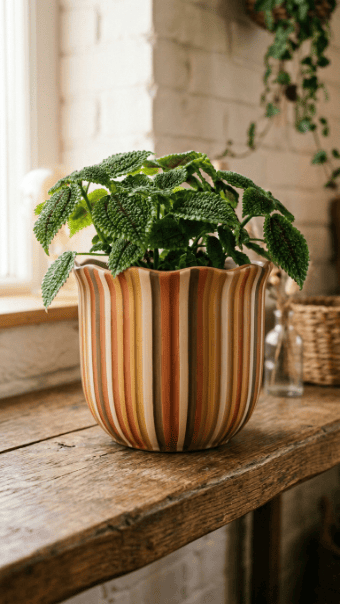
25. Abstract Stripe Boho Pot
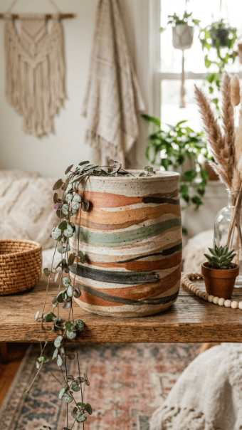
Paint loose stripes.
Vary thickness.
Don’t measure spacing.
26. Galaxy Boho Night Pot
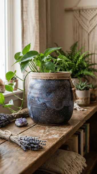
Use dark base.
Add light speckles.
Blend small color patches.
27. Neutral Beige Layered Pot
Stick to one color family.
Layer different shades.
Keep contrast low.
Conclusion
Most people ruin boho designs by trying too hard to control them. Straight lines, perfect symmetry, heavy paint—those kill the look. The strength of this style comes from restraint and texture. Pick one direction, use fewer colors, and stop before it looks overworked. Cheap materials are enough. What matters is how you apply them.