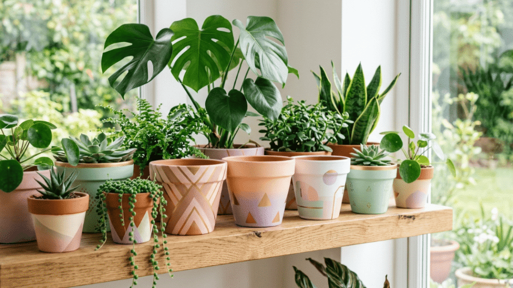
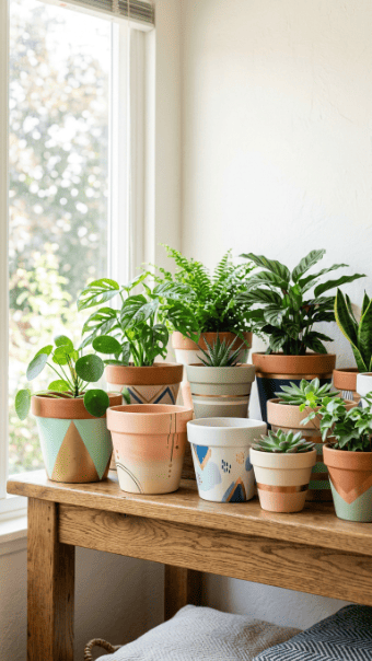
Modern flower pot painting isn’t about random decoration anymore. It’s about control, restraint, and clean visual impact. Most people overcomplicate it and end up with cluttered designs that look amateur. The ideas below fix that. They focus on simple execution, low cost, and results that actually look intentional inside a modern home. If you follow these properly, your pots won’t look like a school project.
1. Color Block Minimal Pots
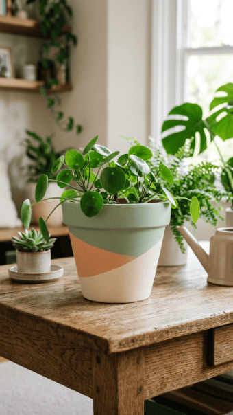
Color blocking works because it forces discipline. You divide the surface into clean sections and commit to limited colors. Most people ruin this by adding too many shades. Don’t do that. Stick to two or three tones max.
Use painter’s tape to map your sections. Press the edges down firmly or you’ll get paint bleeding underneath. That’s the fastest way to make it look sloppy.
Apply thin coats instead of one thick layer. Thick paint creates uneven texture and visible brush strokes. Let each section dry fully before removing the tape.
Budget tip: You don’t need premium paint. Basic acrylic works fine if you seal it later.
If you’re placing it outdoors, apply a matte sealant. Otherwise, fading and peeling will start within weeks.
2. Soft Ombre Gradient Finish
Ombre only looks good when it’s subtle. If the transition is harsh, it fails. Use two shades from the same color family. Anything else looks chaotic.
Start with the darker color at the base. Use a sponge to blend upward into the lighter tone. Don’t rush. Fast blending creates visible lines.
Keep the sponge slightly damp. Dry sponges drag the paint and create streaks.
Test your blend on scrap material first. If you skip that, expect mistakes.
Cheap option: Old dish sponges work just as well as art tools.
Seal the finished pot to lock the gradient. Without sealing, the blend dulls quickly.
3. Sharp Black Line Geometrics
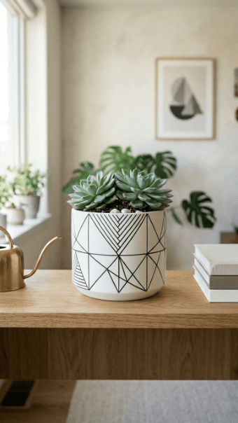
This is where precision matters. Messy lines destroy the whole concept. Use painter’s tape or a ruler with a fine brush.
Start with a neutral base like white or beige. Then add black lines for contrast. That’s enough. Adding more colors weakens the design.
Use a thin brush. Thick lines look clumsy unless you know exactly what you’re doing.
If your hand isn’t steady, don’t freehand. Use guides. There’s no reward for guessing.
Budget tip: A single black paint tube and one brush is all you need here.
Keep spacing consistent. Random gaps make it look accidental instead of designed.
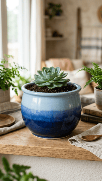
4. Minimal Monochrome Pots
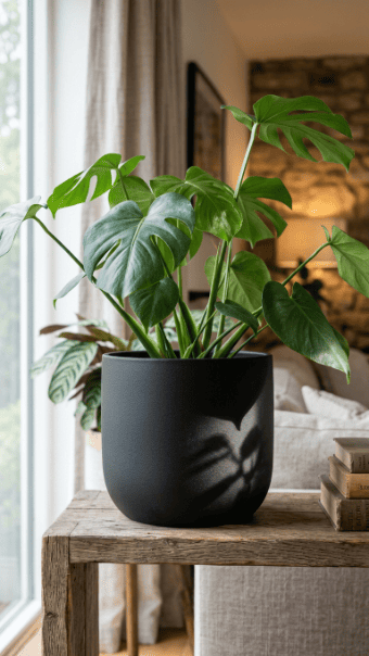
Most people underestimate single-color designs. That’s a mistake. Done right, monochrome looks expensive.
Choose one strong color. Black, off-white, or deep green works well. Avoid bright tones unless you’re confident.
Focus on finish instead of pattern. Matte gives a modern look. Gloss can look cheap if overused.
Apply multiple thin coats for an even surface. One coat will always look patchy.
If you want variation, add subtle texture using a sponge or dry brush.
This approach is cheap and fast. You’re not wasting paint or time on complex designs.
5. Polka Dot Playful Design
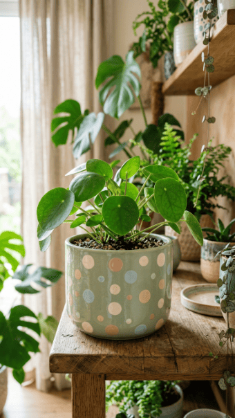
Dots are easy, but most people place them randomly. That’s why it looks messy.
Plan spacing first. Use a pencil to mark positions lightly. Then fill them in.
Use the back of a brush or cotton swab for perfect circles. Freehand dots rarely look clean.
Stick to one base color and one dot color. More than that gets chaotic fast.
Keep sizes consistent or deliberately varied. Don’t mix randomly.
This is one of the cheapest designs you can do. No special tools required.
6. Striped Vertical Lines
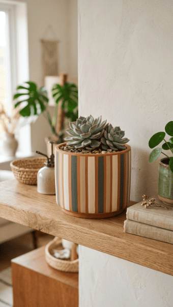
Stripes only work if they’re straight. If you think you can eyeball it, you’re wrong.
Use tape for every line. Measure spacing carefully before painting.
Vertical stripes make the pot look taller. Horizontal stripes make it look wider. Choose based on your space.
Limit colors. Two or three is enough.
Remove tape slowly after drying. Rushing this ruins the edges.
7. Metallic Rim Accent
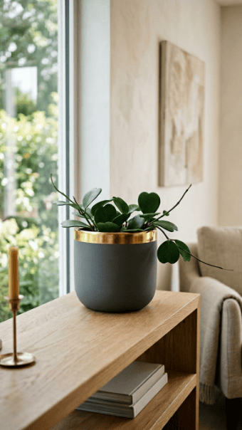
This is one of the easiest upgrades. You don’t need to repaint the whole pot.
Just paint the rim using metallic gold or silver. That’s it.
Use a small brush for control. Tape the edge if needed.
Don’t overdo metallics. Keep it as an accent, not the main feature.
This works especially well on neutral-colored pots.
8. Marble Pour Effect
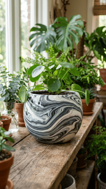
Marble looks complex but it’s mostly controlled chaos.
Pour two or three colors onto the surface and tilt the pot slowly. Let gravity do the work.
Don’t overmix. That turns it into mud.
Work quickly. Acrylic dries fast.
Use a tray underneath to catch excess paint.
Seal with gloss for that polished look.
9. White Doodle on Terracotta
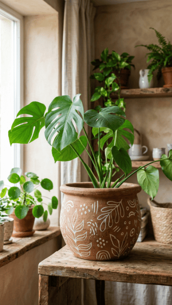
This is the lowest effort design that still looks intentional.
Keep the terracotta natural. Use a white paint pen for doodles.
Simple lines, shapes, or patterns work best.
Don’t overcrowd the surface. Leave space.
It’s cheap, fast, and forgiving.
10. Zen Wavy Line Art
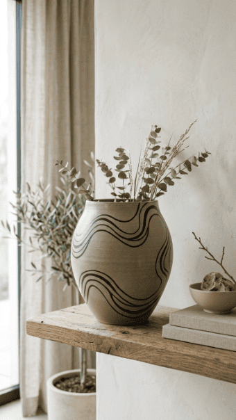
Wavy lines look good when they’re consistent.
Use a steady hand or sketch lightly first.
Keep spacing even.
Use one color only. Multiple colors ruin the calm effect.
This works best on light-colored bases.
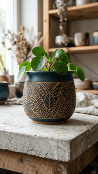
11. Triangle Mosaic Pattern
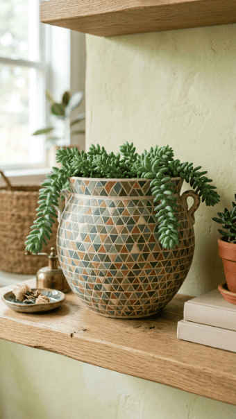
Triangles create structure, but they take patience.
Sketch lightly first. Then fill each triangle.
Use a limited color palette. Too many colors looks chaotic.
Take your time. Rushing creates uneven shapes.
12. Face Silhouette Art
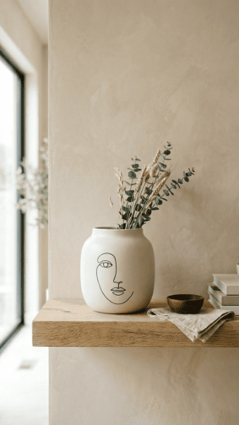
Minimal face designs are trending because they feel artistic.
Keep lines simple. Don’t try to add detail.
Use black on a light base for contrast.
If your drawing skills are weak, trace lightly first.
13. Pastel Soft Shapes
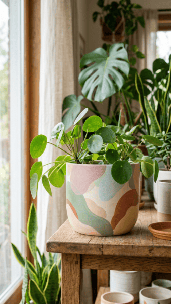
Pastels work because they’re subtle.
Use irregular shapes instead of perfect forms.
Blend edges slightly for softness.
Stick to 2–3 pastel shades.
14. Neon Accent Geometry
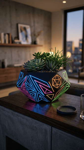
Neon works best as contrast.
Use a dark base like black.
Add small neon shapes or lines.
Too much neon looks cheap.
15. Reverse Stencil Design
This technique flips the usual stencil approach.
Place stencil first. Paint over it.
Remove stencil to reveal clean shapes.
Press edges firmly to avoid bleeding.
16. Textured Antique Finish
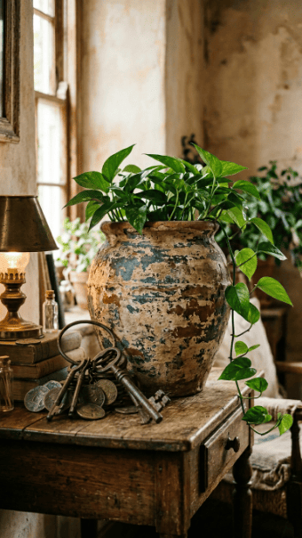
Texture adds depth without complex design.
Use dry brushing or sponge dabbing.
Layer different shades for aged effect.
Don’t aim for perfection. Imperfection is the point.
17. Navy and Copper Contrast
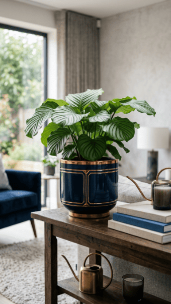
This combination looks expensive when done right.
Use navy as base.
Add copper lines or rim.
Keep it minimal. Overuse ruins the effect.
18. Skyline Silhouette
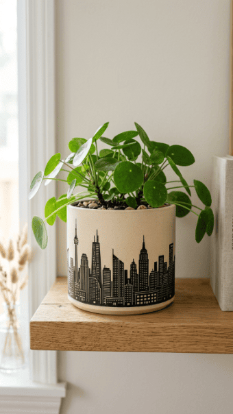
Skyline designs need clean edges.
Use tape or stencil.
Stick to black on light base.
Keep shapes simple.
19. Boho Stitch Pattern
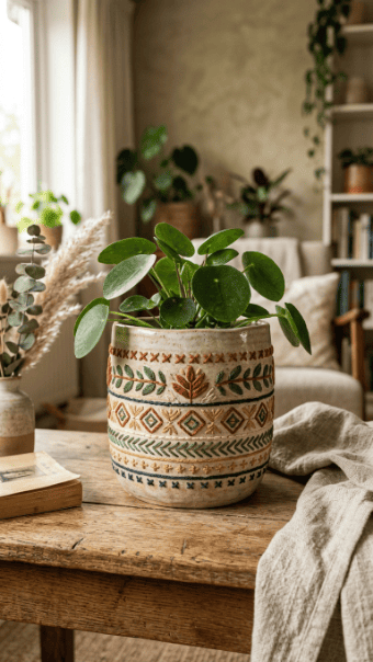
This mimics fabric patterns.
Use thin lines in repeating forms.
Keep spacing consistent.
Use earthy tones for authenticity.
20. Tiered Painted Pot Set
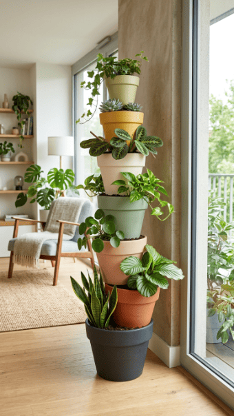
Instead of one pot, create a set.
Use matching colors across all pots.
Stack or arrange vertically.
This creates visual impact without complex painting.
Conclusion
Most people overdesign and end up with something cluttered. The better approach is restraint. Pick one idea, execute it cleanly, and stop. Cheap materials are enough if you focus on precision and finishing. If your lines are sharp and your colors controlled, the result will look intentional instead of random. That’s the difference between decoration and design.