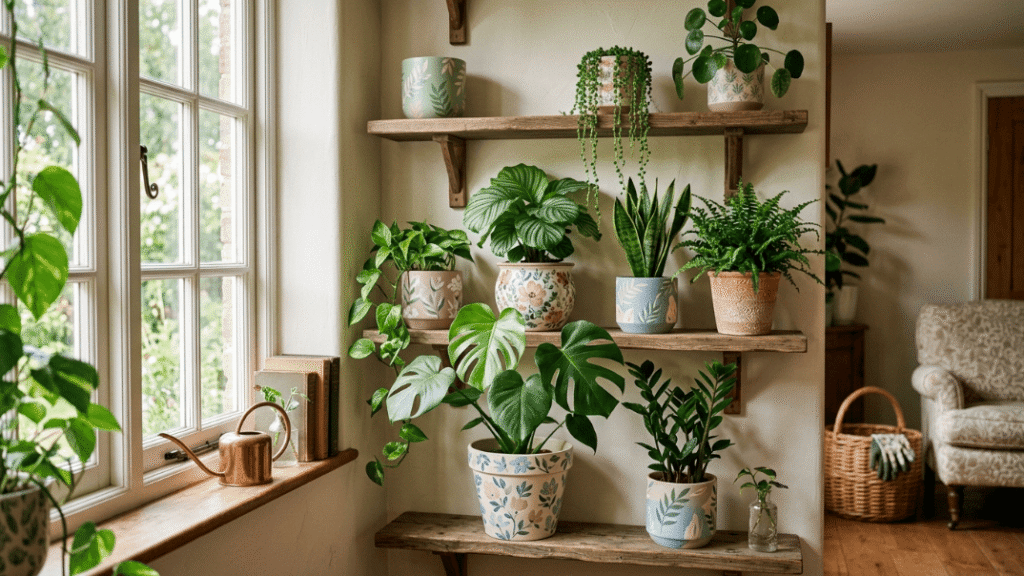
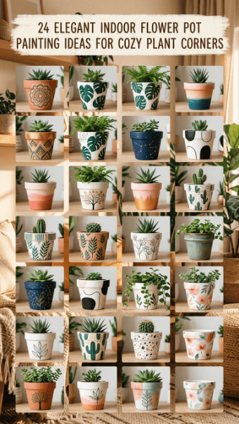
Indoor flower pot painting is one of the easiest ways to make a plant corner feel personal without buying new decor. A plain nursery pot can become a shelf accent, desk detail, or windowsill feature with non-toxic acrylic paint, soft colors, and simple patterns. The best designs are not complicated. They work with your furniture, your plant shape, and the light in the room. Start small, use clean lines, and seal the pot if it may get splashed during watering.
1. Pastel Stripe Shelf Pots
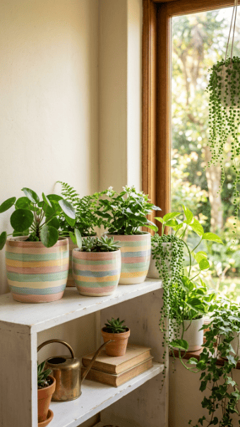
Pastel stripes are calm, easy, and hard to ruin. They work well in bedrooms, offices, and small apartment plant corners.
Start with a white or cream base. Then add soft bands of pink, sage, lavender, or pale yellow. Use painter’s tape if you want clean lines. Freehand works too, but keep the stripes loose and simple.
This idea is great for beginners because mistakes do not stand out much. Soft colors forgive uneven brush strokes.
Use non-toxic acrylic paint for indoor pots. It dries fast and keeps the project low-mess.
Budget tip: Buy one small set of pastel paints instead of full-size bottles. You only use a little paint per pot.
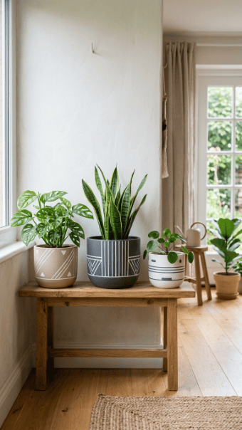
Pair pastel striped pots with pothos, pilea, or small ferns. The plant stays the main feature, while the pot adds quiet color.
2. Monochrome Minimal Pots
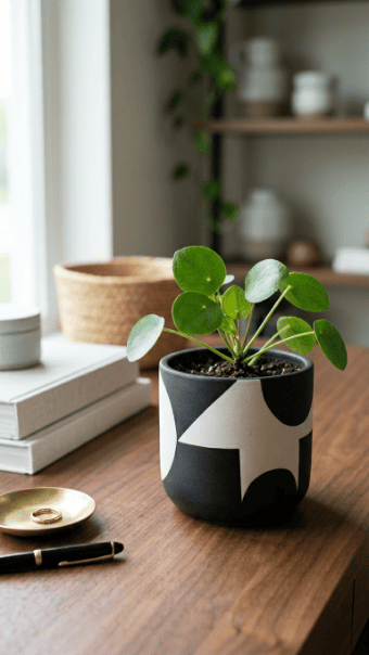
Black and white pots are perfect if your room already has a lot going on. They add structure without adding more color.
Paint the pot white first. Then add black arches, lines, half circles, or dots. Keep the pattern spaced out. Crowding the design makes it feel cheap.
This style works well on plastic nursery pots because smooth sides make the lines easier to control.
Use a fine brush or paint marker for sharp details. A black acrylic marker is the easiest option.
Budget tip: Paint old plastic pots instead of buying ceramic ones. A clean monochrome finish can make them look much better.
Use this design for snake plants, ZZ plants, or rubber plants. Strong leaf shapes match the simple pot design.
3. Warm Terracotta Tone Pots
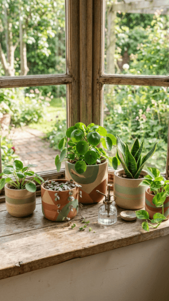
Warm natural tones make indoor plant corners feel grounded. Think sand, clay, cream, muted green, and soft brown.
You do not have to cover the whole pot. Paint wide bands or simple blocks and leave some terracotta showing.
This works especially well with herbs, succulents, and small leafy plants. The colors feel calm beside natural wood, woven baskets, and linen curtains.
Use matte acrylic paint for a softer finish. Gloss can look too shiny indoors.
Budget tip: Mix a little white into leftover brown or green paint to make softer shades.
Let the paint dry fully before placing the pot back on a shelf. Acrylic can feel dry on top but still mark surfaces underneath.
4. Tiny Heart Accent Pots
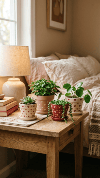
Heart motifs can look sweet without becoming childish. The trick is scale. Keep the hearts small and spaced apart.
Start with a soft base color like cream, blush, or pale terracotta. Add tiny hearts with a fine brush or dotting tool.
Use one accent color only. Red, coral, or rose works well. Too many colors make the design look messy.
This is a good idea for desk plants, gift pots, or small bedroom shelves.
Budget tip: Use a toothpick to shape each heart if you do not have a detail brush.
Try this on mini pots with succulents, hoya cuttings, or baby spider plants. The small plant size matches the delicate pattern.
Seal lightly if the pot will be watered often.
5. Soft Floral Overlay Pots
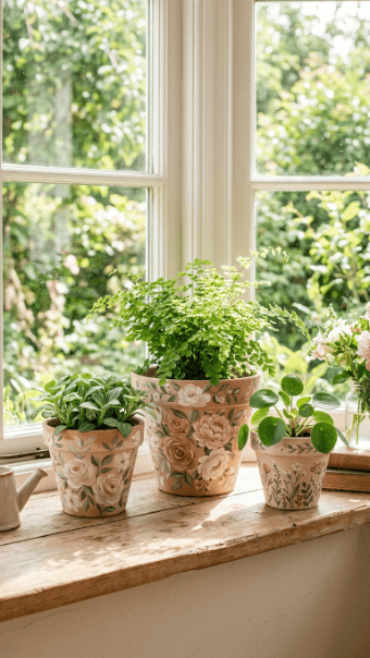
Floral pots work best when the flowers are simple. Do not try to paint perfect roses or detailed petals.
Use small brush strokes. Five dots can become a flower. A short green line can become a stem.
Paint the base in cream, pale blue, or soft green. Then add tiny flowers across one side of the pot.
This design looks good on shelves where the pot is viewed from the front. You do not have to decorate the back.
Budget tip: Use cotton swabs for flower centers and a toothpick for stems.
Pair floral pots with plants that have plain green leaves. That keeps the pot and plant from fighting for attention.
Let each color dry before adding another so the shapes stay clean.
6. Painted Vine Drapes
Vine designs make the pot feel connected to the plant. They are also easier than they look.
Paint thin green lines from the rim downward. Add small leaves along each line. Keep the vines uneven so they look natural.
This works well with pothos, philodendron, ivy, and string plants.
Use a light base color so the vines show clearly. White, cream, pale gray, or soft clay works well.
Budget tip: Use one green paint and mix it with white for leaf highlights.
Do not cover the whole pot with vines. Leave space so the design can breathe.
A fine brush helps, but a green paint marker also works for cleaner lines.
7. Simple Animal Face Pots
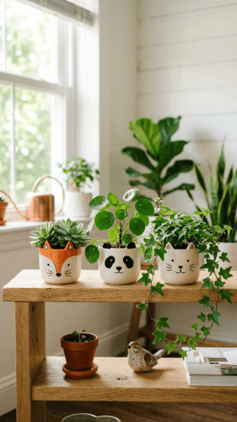
Animal face pots are fun, but they go wrong when overdone. Keep the face simple.
Paint two eyes, a tiny nose, whiskers, or small ears. Let the plant do the rest.
A cat face works with grass-like plants. A bear face works with round leafy plants. A bunny face works with upright stems.
Use black paint for the features and a soft base color for the pot.
Budget tip: Use an outdoor-safe paint marker for cleaner face details. It is less messy than a tiny brush.
This idea is good for kids’ rooms, desks, and casual shelves.
Keep the expression simple. Too many details make the pot look cluttered.
8. Subtle Gold Rim Pots
A gold rim gives a plain pot a finished look without making it loud.
Paint the pot cream, black, sage, or clay. Once dry, tape off the rim and add metallic gold paint.
Use a thin coat. Thick metallic paint can look uneven and cheap.
This design is great for living rooms and bedrooms because it looks polished but still calm.
Budget tip: One tiny bottle of gold paint can cover many pots.
Use this style on small ceramic pots, plastic planters, or terracotta. If the surface is slick, sand it lightly first.
Pair it with leafy plants, orchids, or small palms. The gold edge catches light near a window.
9. Glossy Pink Plastic Pot Makeover
Plastic nursery pots can look cheap, but paint changes that fast.
Clean the pot well. Lightly sand the surface so paint sticks better. Use spray paint made for plastic if you want a smooth finish.
Soft pink, peony, blush, or dusty rose works well indoors. These colors pair nicely with green leaves and pale furniture.
Spray outdoors or near strong airflow. Let the pot dry fully before bringing it inside.
Budget tip: Reuse pots from store-bought plants. A painted plastic pot costs far less than a new ceramic planter.
Keep the shape simple. Glossy color already adds enough interest.
This is a good project when you have several mismatched plastic pots.
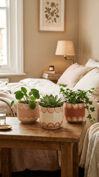
10. Rainbow Arc Pots
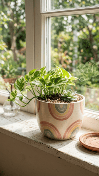
Rainbow arcs add color without covering the whole pot. They look best when the shades are muted.
Use cream or white as the base. Paint half-circle arcs in terracotta, blush, mustard, sage, and pale blue.
Sketch the arcs lightly with pencil first. Then fill them in with a small brush.
This design works well on round pots because the shape supports the curve.
Budget tip: Use small paint bottles and repeat the same palette across several pots.
Keep the arcs on one side only. That gives the pot a cleaner look on shelves.
Pair this with small leafy plants, succulents, or a peace lily.
11. Ribbed Matte Green Pots
Ribbed texture makes a pot feel handmade. You can fake the look with paint and simple raised lines.
Use a base coat of matte green. Then add vertical lines using thick paint or a raised craft medium.
Keep the lines evenly spaced, but do not worry about perfection. A handmade feel works here.
This style is great with foliage plants because green-on-green feels calm and rich.
Budget tip: Use an old comb to drag soft lines through thick paint before it dries.
Let textured paint dry longer than normal. Raised areas stay soft underneath.
Use this idea on plain plastic pots to make them look more expensive.
12. Mini Polka Dot Pots
Mini polka dots are easy and cheerful. They work well for small pots on shelves, desks, and windowsills.
Paint the pot a solid color first. White, tan, gray, or soft pink works well. Then add tiny dots with the end of a brush.
Keep the dots small. Large dots can overpower a tiny plant.
Use one color for a clean look or two colors for a playful one.
Budget tip: A pencil eraser makes perfect dots. No special tool required.
This design works well with succulents, cacti, and tiny trailing plants.
Let the base coat dry fully before adding dots. Wet layers can smear and leave uneven spots.
13. Abstract Geometric Pots
Abstract shapes are a smart choice if you do not want perfect patterns.
Paint circles, blocks, arches, and lines in different sizes. Keep the colors calm so the pot still fits the room.
Use beige, black, olive, cream, and terracotta. These shades work with most interiors.
Start with the biggest shape. Add smaller shapes after it dries.
Budget tip: Use painter’s tape for straight blocks and bottle caps for circles.
This design works best on smooth pots. Bumpy terracotta can make shape edges rough.
Place the pot near plain furniture so the design gets attention without making the corner look busy.
14. Blue and White Indoor Pots
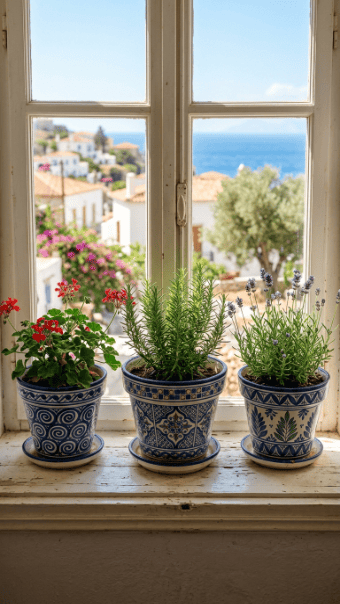
Blue and white works indoors because it feels clean and airy.
Paint the pot white first. Then add blue lines, dots, tile shapes, or simple floral marks.
Do not overload the design. A few repeated shapes look better than a crowded pattern.
This idea works well in kitchens, sunrooms, and bright living rooms.
Budget tip: Use a blue acrylic paint marker for quick details.
Pair blue and white pots with herbs, ferns, or trailing ivy.
If the pot is terracotta, prime it first so the white paint looks even. Finish with a water-based clear coat if watering splashes the sides.
15. Sweet Cone-Inspired Pots
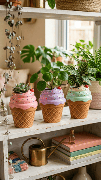
A cone-inspired pot can be playful without looking silly. Keep the design clean.
Paint the lower half tan. Add simple diagonal lines to suggest a cone pattern. Paint the upper half in soft pink, cream, mint, or lavender.
This works best on small pots with rounded plants or succulents.
Budget tip: Use masking tape for the diagonal lines instead of trying to freehand every mark.
Do not add too many tiny details. The idea should read from across the room.
Use this style for a craft room, child’s room, or cheerful kitchen shelf.
Seal the pot if it will sit near a sink or humid window.
16. Abstract Face Line Pots
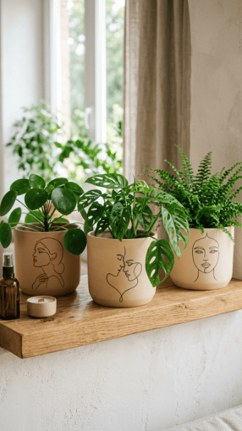
Line art faces are stylish and simple. You only need a plain pot and a steady hand.
Paint the pot white, beige, or soft clay. Then draw one continuous face line with black paint.
Practice on paper first. Once the line goes on the pot, corrections can get messy.
Use a paint marker if a brush feels hard to control.
Budget tip: Start with one side of the pot only. You do not have to decorate the full surface.
This idea works well with tall plants because the simple face balances the vertical leaves.
Keep the expression calm. Minimal features look better than detailed eyes and lips.
17. Handmade Brush Texture Pots
Brush texture hides mistakes, which makes it perfect for beginners.
Start with a matte base coat. Then use a dry brush to add short strokes in a nearby shade.
Clay with cream. Sage with olive. Beige with white. Keep the colors close.
This gives the pot a handmade look without special supplies.
Budget tip: Use an old, stiff brush. It creates better texture than a new soft brush.
Do not cover every inch evenly. Variation makes the finish feel natural.
This style works well with woven baskets, wood shelves, and linen curtains.
Let the paint dry before adding a clear matte coat.
18. Scalloped Edge Pots
Scalloped edges add a soft shape to a plain pot. They are easier than they look.
Paint the pot one base color. Then draw half circles around the rim or lower edge.
Use a small round object as a guide if you want even scallops. A bottle cap works fine.
Blush, cream, terracotta, and sage look great together.
Budget tip: Paint only the rim area to save time and paint.
This design works well for bedroom plant corners and side tables.
Avoid high-contrast colors if you want a calmer result. Soft colors make the scallops feel gentle instead of busy.
19. Muted Checkerboard Pots
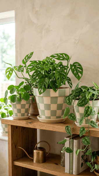
Checkerboard pots are trendy, but bold black and white can feel harsh indoors.
Use softer pairings instead. Cream and sage. Beige and rust. Pale pink and clay.
Mark the grid lightly with pencil. Paint every other square first, then fill the rest after drying.
This takes patience, but the result looks intentional.
Budget tip: Paint only one band around the pot instead of the whole surface.
This style works best on straight-sided pots. Curved pots make the grid harder.
Pair muted checkerboard pots with simple green plants so the pattern does not compete with variegated leaves.
20. Color Block Plant Pots
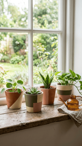
Color blocking is fast and clean. It also works with almost any room style.
Tape off simple sections. Paint the bottom half, one side, or a diagonal corner.
Use two colors if you want a calm look. Use three if the pot is large.
Clay, cream, olive, and blush are safe indoor choices.
Budget tip: Use leftover wall paint samples. They often work well for indoor decorative pots.
This is a good way to make mismatched pots feel related. Use the same palette across all of them.
Let the paint dry before removing tape so the edges stay tidy.
21. Tiny Botanical Sprig Pots
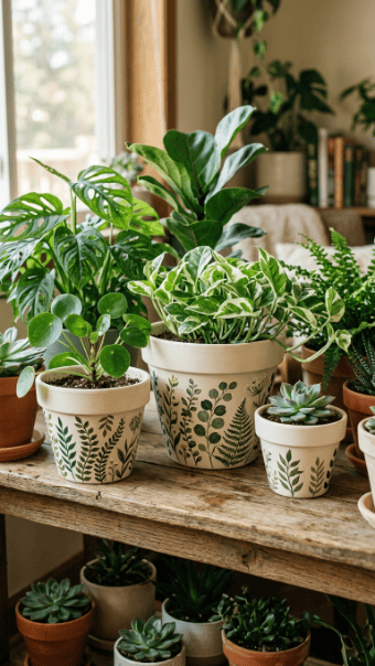
Botanical sprigs are softer than full floral designs. They suit calm spaces and small shelves.
Paint thin stems with small leaves. Keep the pattern light and spaced apart.
Use a neutral base like cream, tan, or pale gray. Green details show well against these colors.
This design is good for people who want something decorative but not loud.
Budget tip: Use one small green acrylic bottle and mix it with white for lighter leaves.
Try this on herb pots, fern pots, or tiny cuttings.
Do not paint all the way around if the pot sits against a wall. Decorate the visible side and save time.
22. Romantic Pastel Shape Pots
Soft pastel shapes can make a plant corner feel gentle and cozy.
Use lavender, blush, cream, and pale peach. Paint circles, arches, or soft blocks.
Keep each shape large enough to see. Tiny details can look cluttered from across the room.
This design works well near reading chairs, vanity tables, and bedroom shelves.
Budget tip: Buy one pastel paint set and use it for several pots.
Use a matte finish for a softer look. Gloss can make pastel colors feel too bright.
Pair these pots with trailing plants, calatheas, or small flowering houseplants.
Simple shapes make the design feel grown-up, not childish.
23. Nordic Clean Line Pots
Nordic-style pots are about restraint. Use light colors, clean lines, and open space.
Paint the pot white, beige, or pale gray. Add one or two thin lines around the middle or rim.
Do not add extra shapes just because there is empty space. The empty space is part of the design.
This style works well in small apartments because it does not make shelves feel crowded.
Budget tip: Use painter’s tape and a tiny amount of black or charcoal paint.
Pair these pots with sculptural plants like snake plants, rubber plants, or peace lilies.
A matte clear coat keeps the finish soft and protects it from water marks.
24. Soft Light Accent Pots
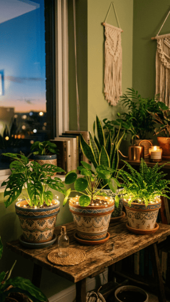
Painted pots can work with soft lighting for a cozy evening plant corner.
Paint the pot in a calm shade like cream, clay, sage, or muted pink. Then wrap a tiny battery light strand around the rim or shelf nearby.
Keep the painting simple. A rim band, dots, or soft stripes are enough.
Do not paint over lights or wires. Keep the pot safe and easy to water.
Budget tip: Use a small light strand from seasonal decor and repaint an old pot to match.
This idea works well for bedrooms, reading corners, and low-light shelves with hardy plants.
Use battery lights only, and keep water away from the battery pack.
Conclusion
Indoor flower pot painting works best when the design fits the room instead of fighting it. Use soft colors, simple patterns, and non-toxic acrylic paint. Start with one old pot before painting a whole set. Pastel stripes, monochrome shapes, gold rims, vine details, and warm terracotta tones are easy places to begin. A few painted pots can make a shelf, desk, or windowsill feel more planned without spending much.